Shihuo App
Rebranding, 2019
Art Director: Alex
Designer: Alex, Xiao Wei
Motion: Karo
Client: Hupu
With the emergence of multiple consumption environment, the main force of new generation of consumption has risen in an all-round way. For the usersof SHIHUO, except the product, they pay more attention to reflect their own personality and attitude through the cultural added value contained in the product. Therefore, rejuvenation is not onlya unilateral value outputfor brands, but an opportunity to grow together with young people. Brands with closer distance and higher recognition will undoubtedly gain greater trust. In order to cater to the young peopleand multiple consumption environment, we have carried out a comprehensive and diversified upgrade of the brand from the perspective of values, personalityandstyle together with the SHIHUO team.
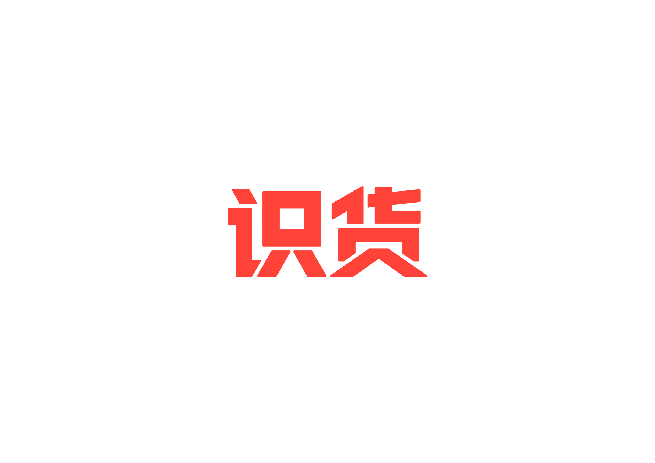
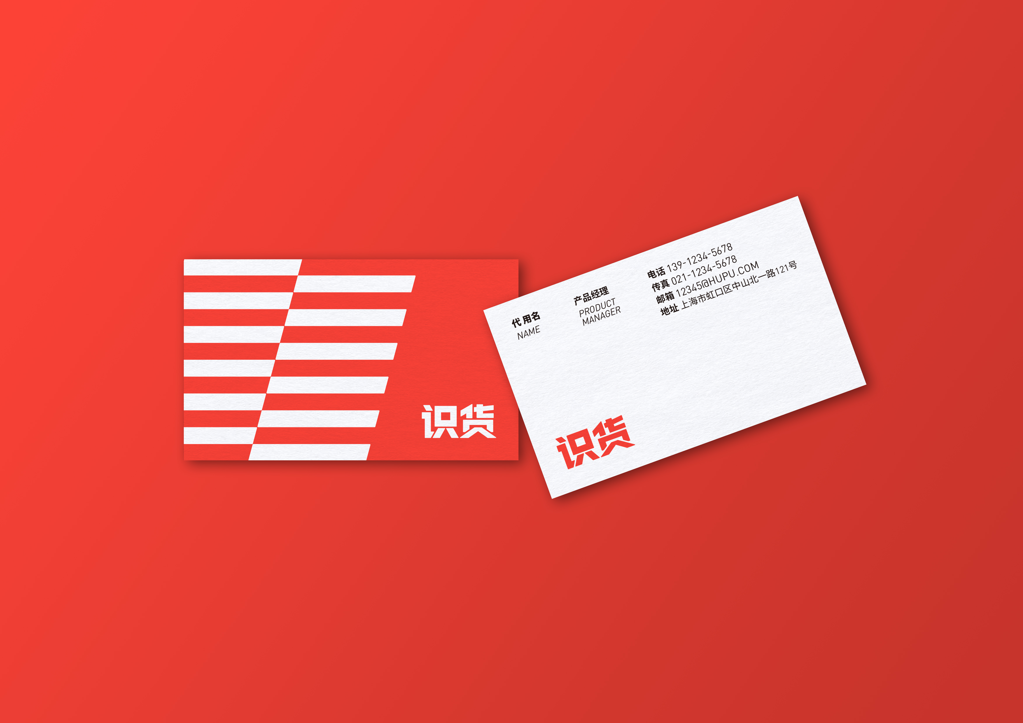
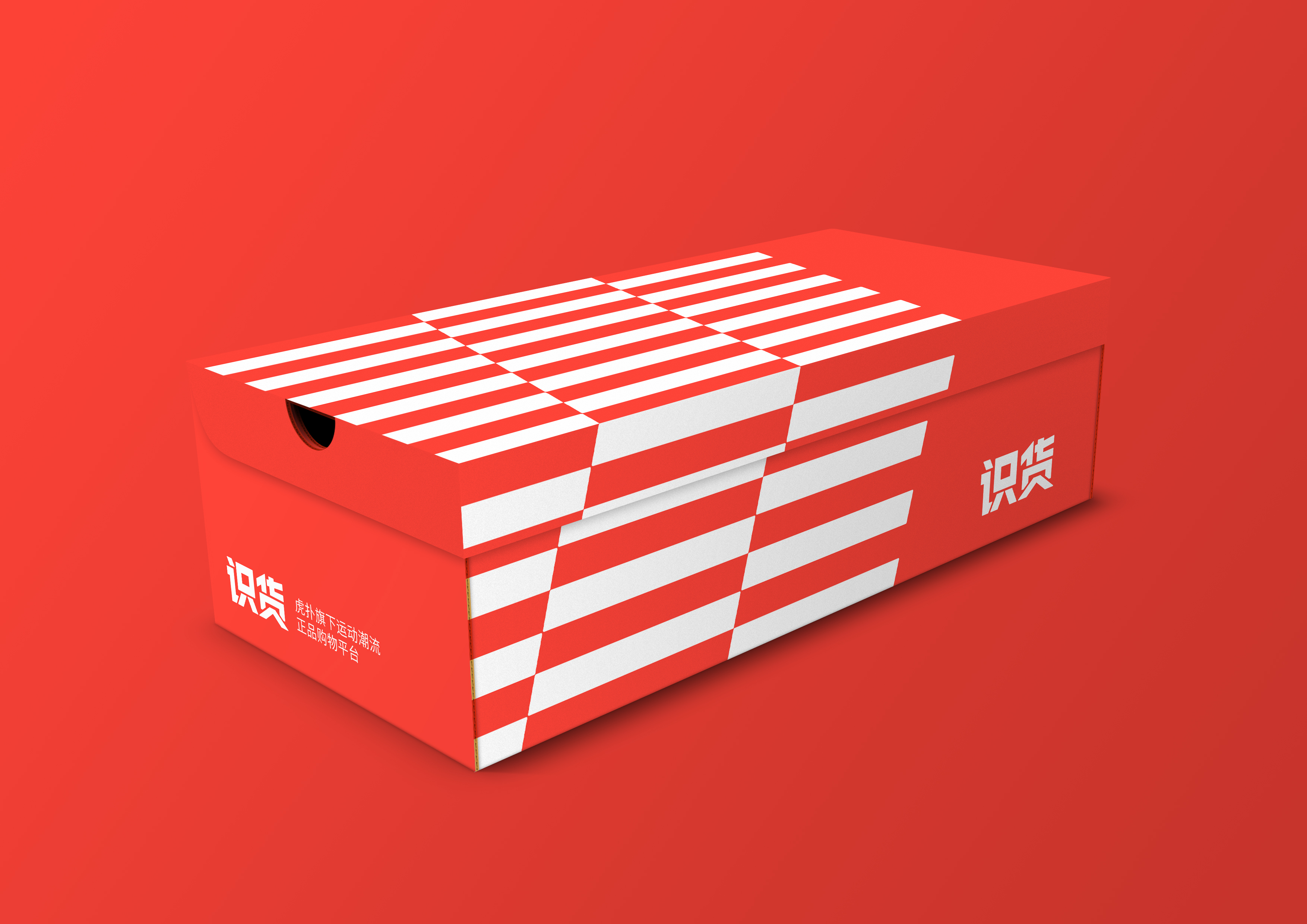
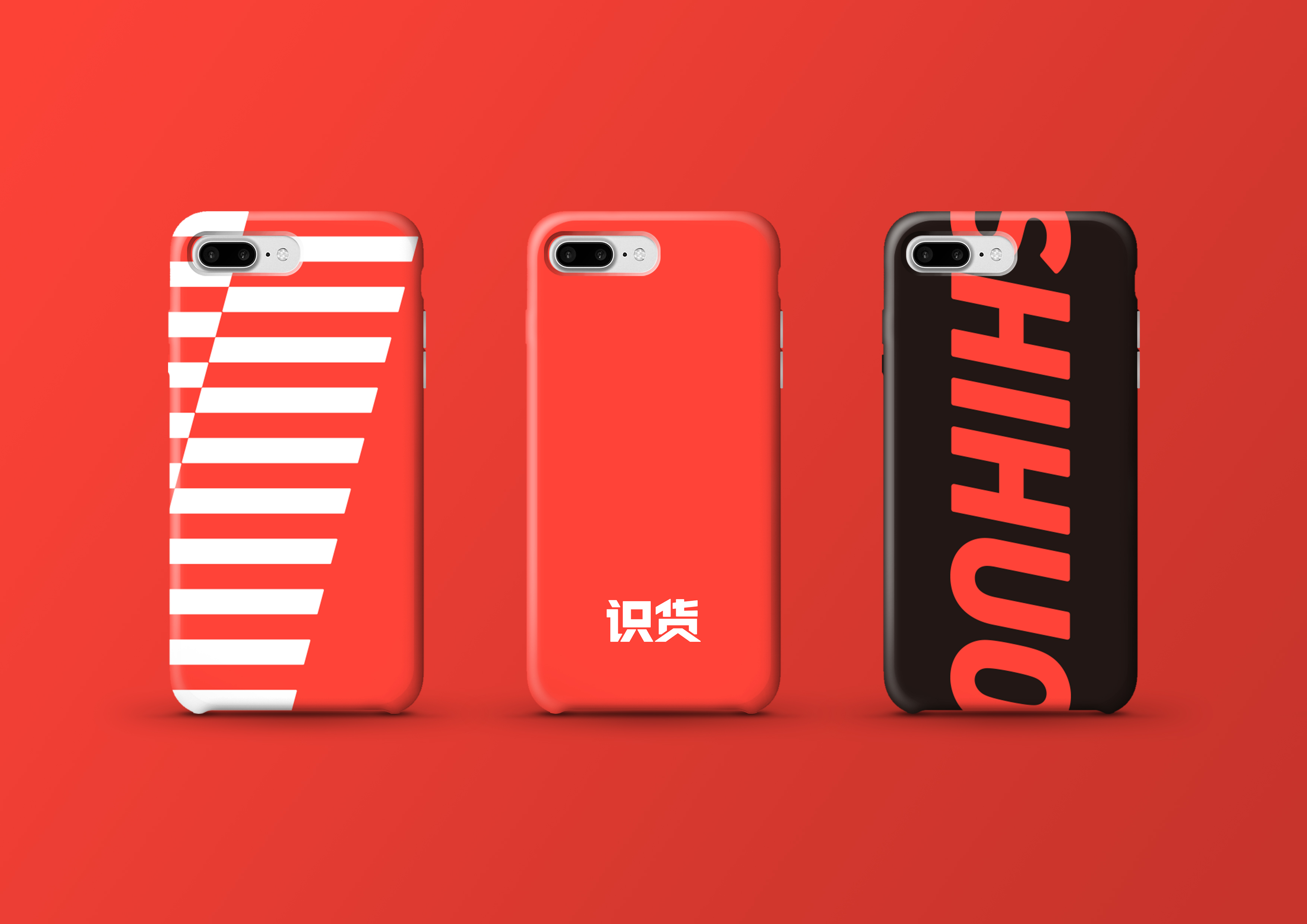
The new logo retains the complete word “SHIHUO”. We emphasize the name itselfandhoping to turn the name into the biggest asset of the brand, and become a hammer into the visual memory of consumers, which is deeply rooted and hard to replace. Theoriginal design fonthas achieved eye-catching visual effect andconvey a confident brand attitudeatthesametime. Thedark red oldlogois a little old-fashioned in the visual expression. In order to match the spirit of youth, we choose the bright lava red, which is more tensile but not incompatible. No matter theway ofthe new color system is spread, it injects a new impetus into the visual expression. It is exciting and fits the attributes of sports. The new logo retains the complete word “SHIHUO”. We emphasize the name itselfandhoping to turn the name into the biggest asset of the brand, and become a hammer into the visual memory of consumers, which is deeply rooted and hard to replace. Theoriginal design fonthas achieved eye-catching visual effect andconvey a confident brand attitudeatthesametime.Thedark red oldlogois a little old-fashioned in the visual expression.In order to match the spirit of youth, we choose the bright lava red, which is more tensile but not incompatible. No matter theway ofthe new color system is spread, it injects a new impetus into the visual expression. It is exciting and fits the attributes of sports.
隨著多元消費場景的出現,新一代消費主力軍全面崛起,對於識貨的用戶來說,除了產品本身,他們更注重通過產品所包含的文化附加值來體現自身的個性與態度。因此,對於品牌,年輕化並不是單方面的價值輸出,而是和年輕人共同成長的契機,距離更近,認同度更高的品牌,無疑會獲得更大的信賴。為了迎合年輕,多元的消費環境,我們和識貨團隊一起,從價值觀,個性,風格等角度對品牌進行了全方位的多元化升級。
新標誌保留了完整的「識貨」二字,我們強調名字本身,希望能夠將品牌名稱變為品牌最大的資產,成為打入消費者視覺記憶的重錘,根深蒂固,難以取代。原創設計的字體,達到視覺效果醒目的同時更傳達出自信有力的品牌態度。舊版識貨形象的深紅色在視覺感受上稍顯老成,為了匹配年輕化的精神內核,我們選擇了明亮的熔岩紅,更具張力而又不失親和。新色系無論是在何種傳播途徑,都為視覺表現注入全新動力,目之所及令人澎湃興奮,與運動領域的屬性一拍即合。