Rhino Rescue
Identity, Packaging, 2023-2024
Creative Director: Alex
Art Director: Alex
Designer: Hawk, Megan, Tank@Rhino Rescue
Illustrator: Yilan
Motion: Hawk
Project Manager: Cong-cong
Client: Rhino Rescue
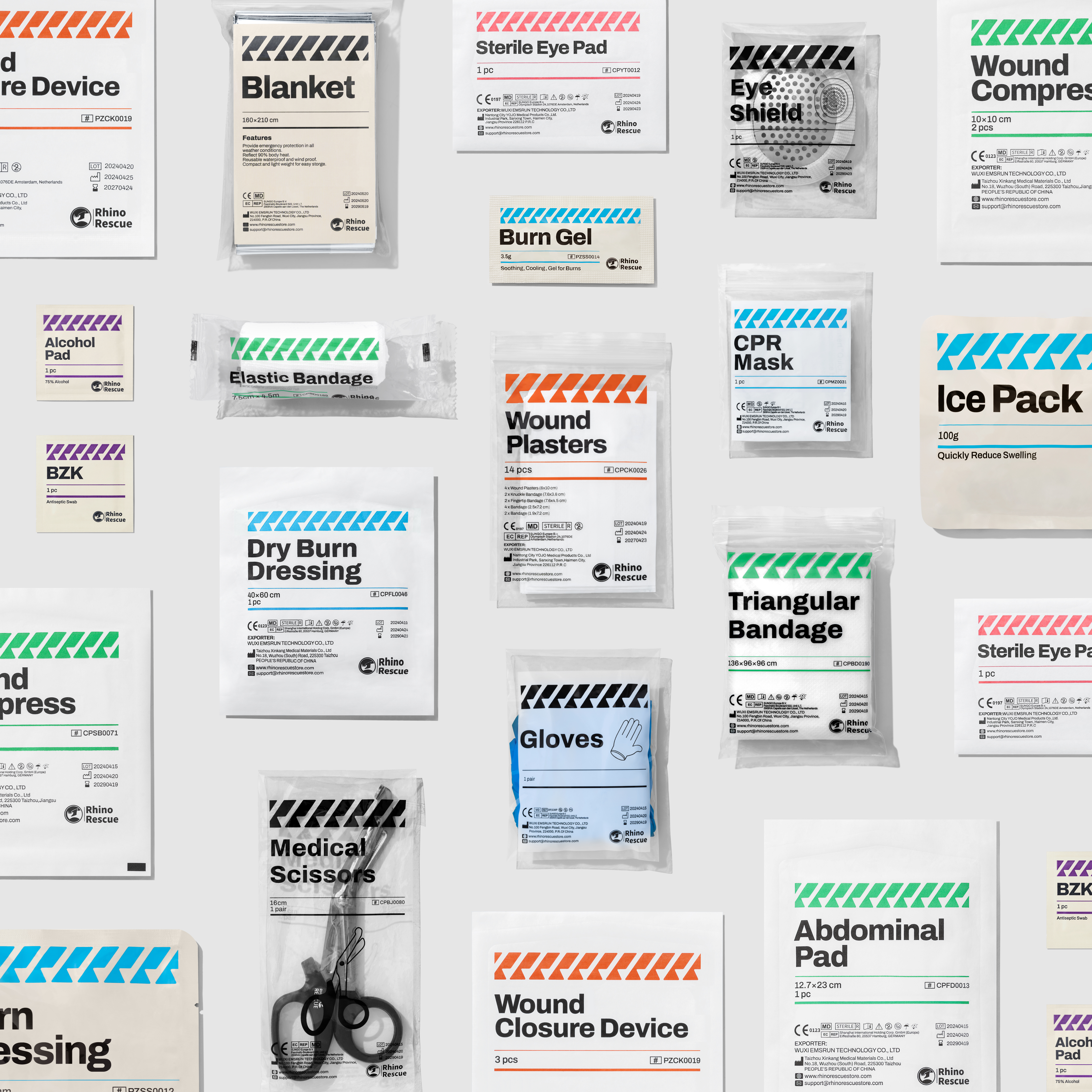
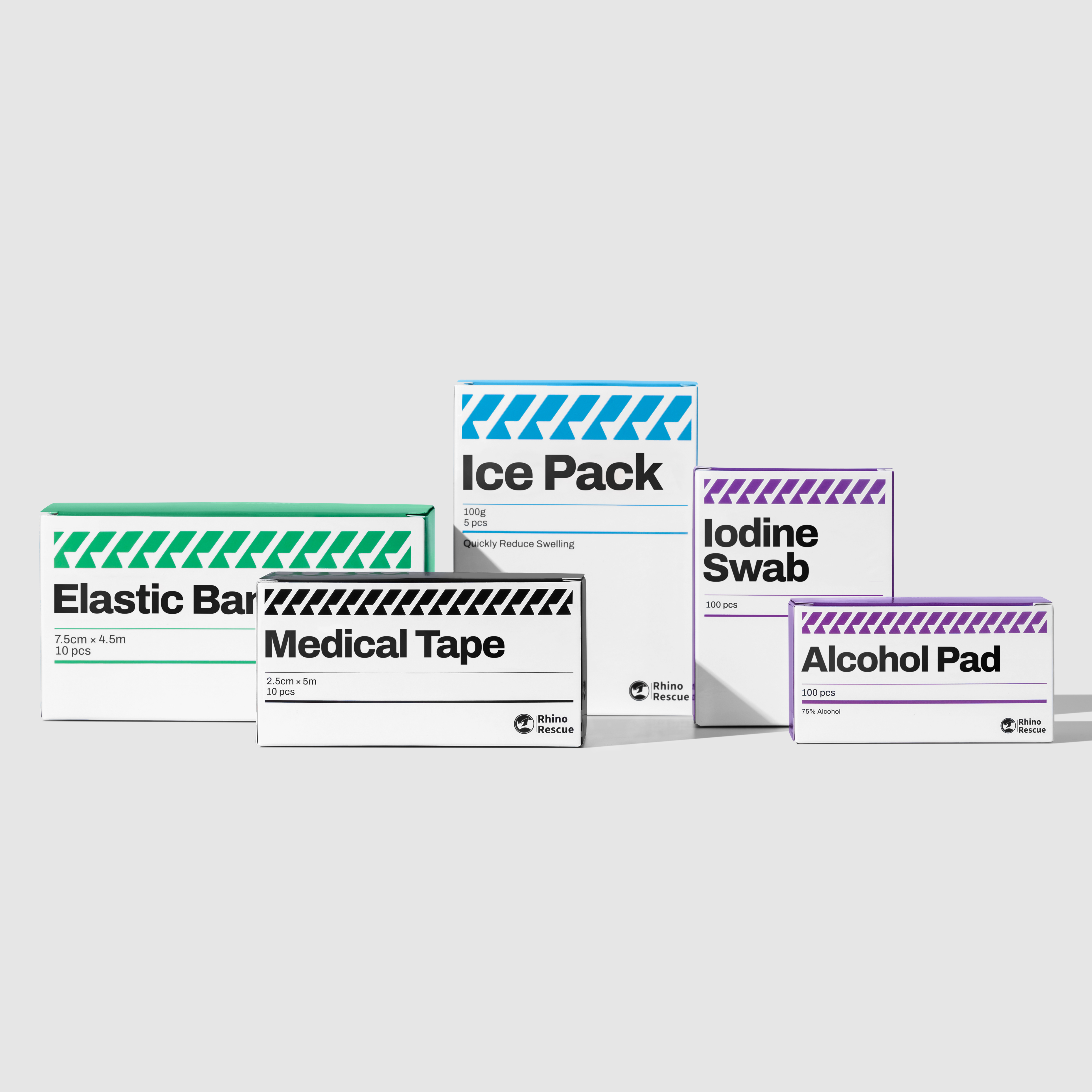
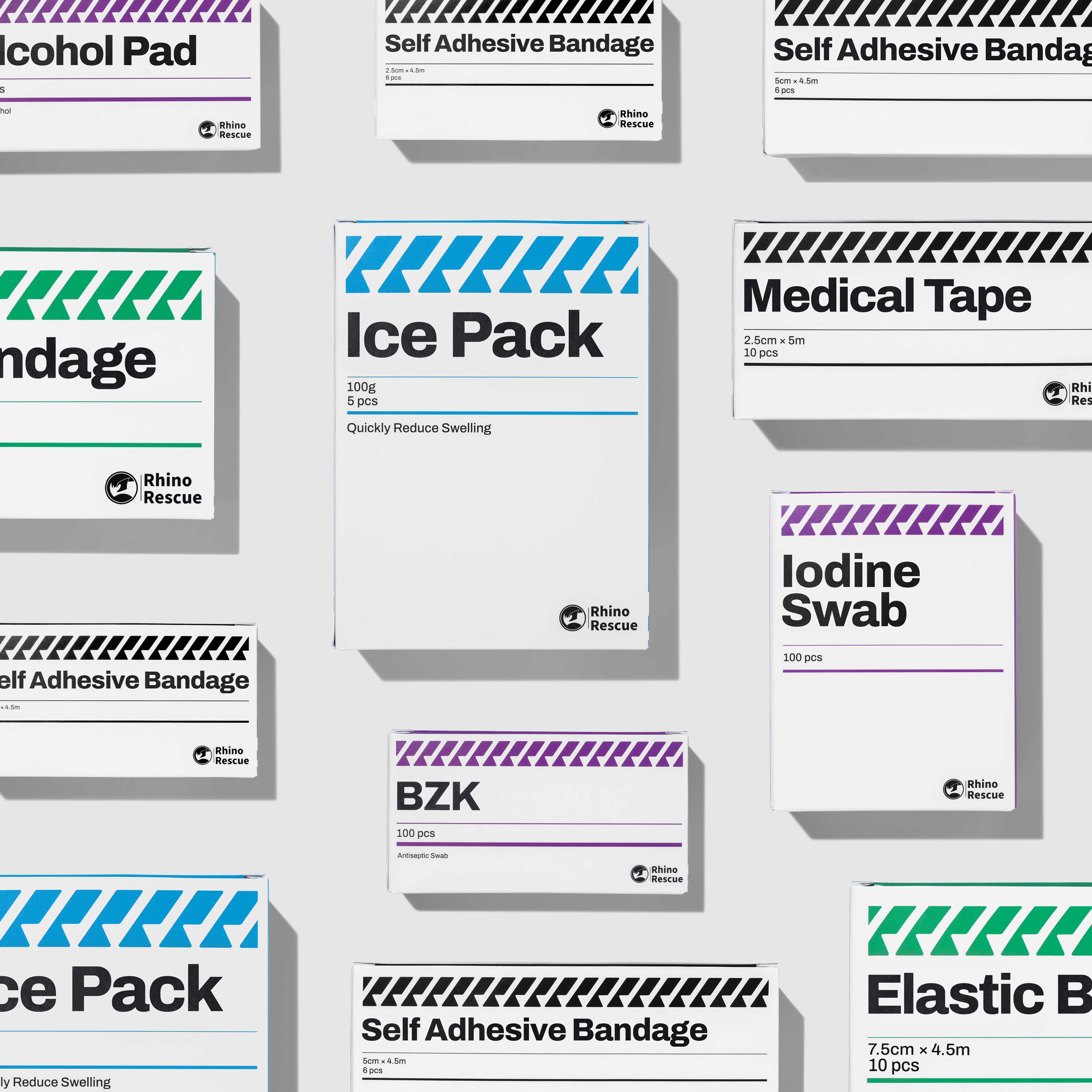
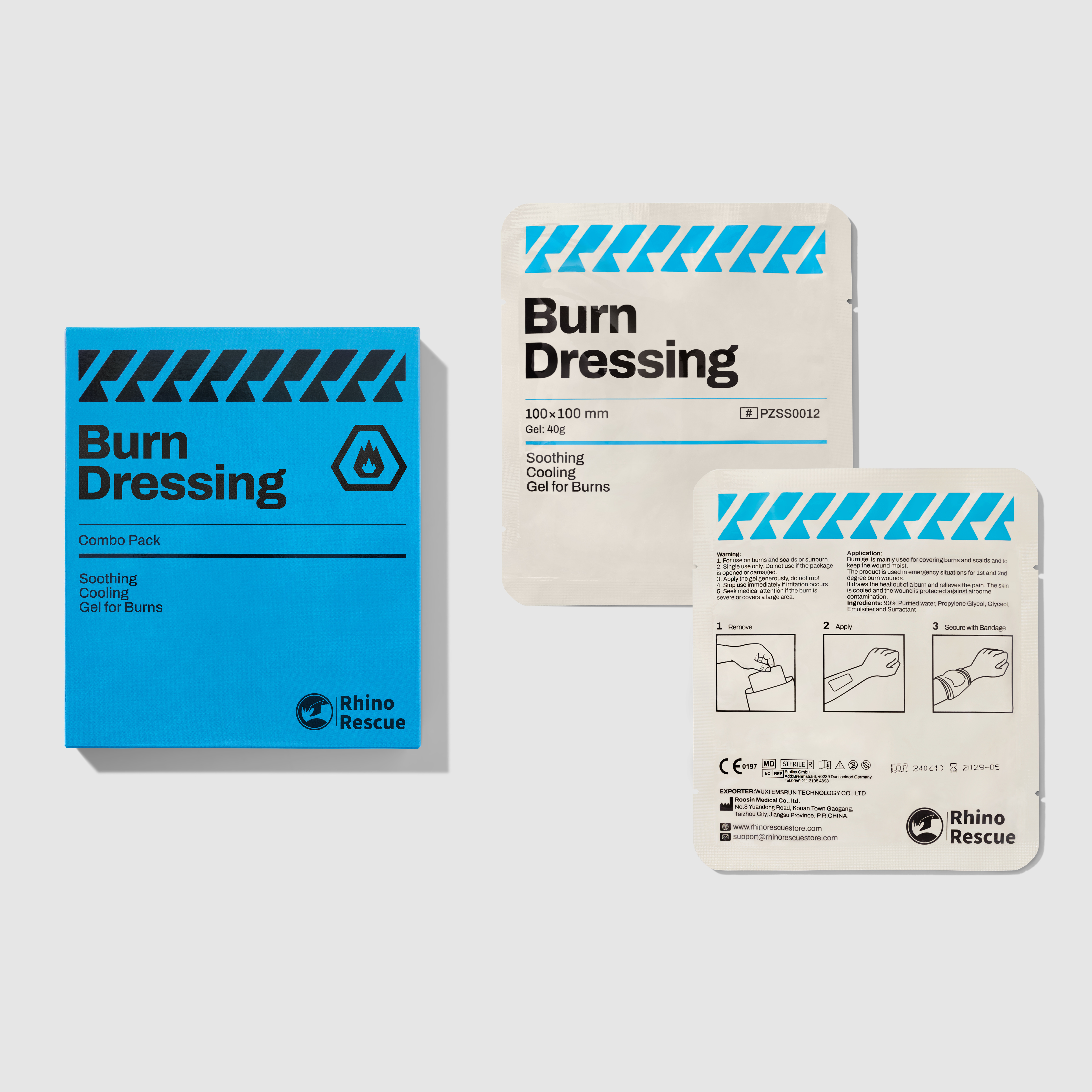
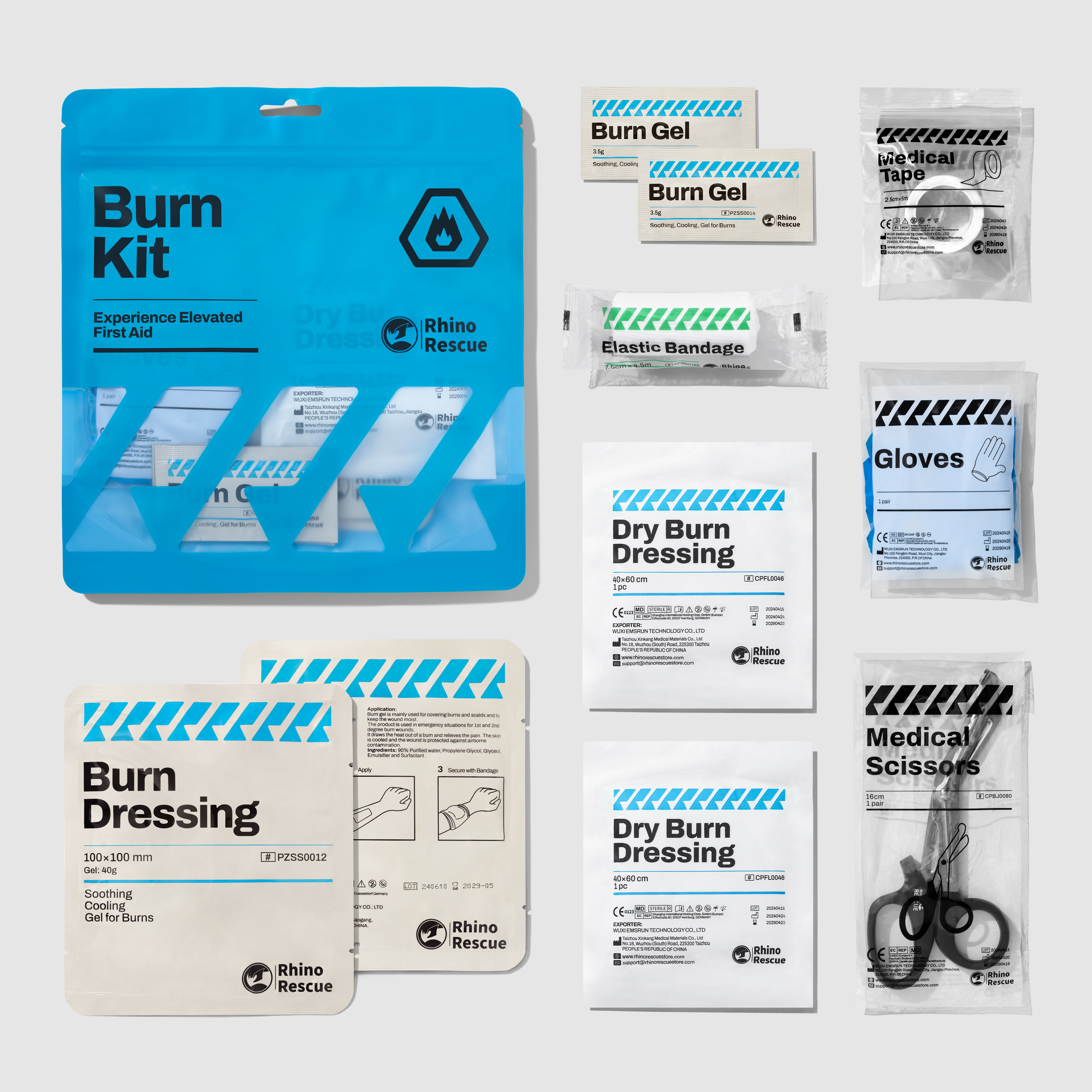
Rhino Rescue is a military first aid brand that has entered the markets of more than ten countries around the world. We designed the packaging identity system for its new civilian product line. As the brand logo has been registered in many countries around the world, we used the brand name’s first letters “R” and rhino horns as memory points, designed stripe line symbols that symbolize rescue and are exclusive to the brand. It is used in combination with the existing logo on product packaging of different specifications and materials, and combined with a clear and easy-to-read layout, to create a distinctive, fast and professional image of civilian first aid supplies.
犀牛救援是一個已經進入全球十多個國家市場的軍用急救用品品牌,我們爲其全新的民用産品線設計了包裝識別系統。由于品牌Logo已經在全球多國注冊,我們以品牌名首字母雙“R”和犀牛角爲記憶點,設計了象征救援和專屬于品牌的警示線符號,它與現有Logo搭配應用于不同規格和材質的産品包裝上,再結合清晰易讀的版式,塑造出一個鮮明、快速、專業的民用急救用品形象。
