Nice Princess
Rebranding, Packaging, 2022-2023
Collaborate with VIW Design, Seoul
Creative Director: Daniel@VIW
Strategy: Thea@VIW
Art Director: Alex
Designer: Megan, Hawk, Alex
Motion: Hawk
3D: Ccisok
Project Manager: Daniel@VIW
Client: Purcotton
Rebranding, Packaging, 2022-2023
Collaborate with VIW Design, Seoul
Creative Director: Daniel@VIW
Strategy: Thea@VIW
Art Director: Alex
Designer: Megan, Hawk, Alex
Motion: Hawk
3D: Ccisok
Project Manager: Daniel@VIW
Client: Purcotton
Nice Princess is a sanitary pads brand under Purcotton, and we have collaborated with the Seoul based design team VIW to complete its rebranding.
Relying on the powerful raw material technology of Winner Medical, the parent company of Purcotton, Nice Princess has become the only brand in the sanitary pads category labeled as 100% cotton. Its products leave a comfortable and natural impression on users, and also determine its high-end market positioning. However, the previous branding of Nice Princess is no different from other mid and low end brands in the industry, and cannot reflect its product competitiveness and matching aesthetic style. Driven by new consumer demands, Nice Princess focuses on young customers and comprehensively upgrades the brand visual around product packaging.
In the strategy phase, we summarized three key words that reflect the core of the brand: soft, powerful, and nature, based on the product advantages of Nice Princess and the value orientation of young audiences, and proposed the brand spirit - soft yet powerful.
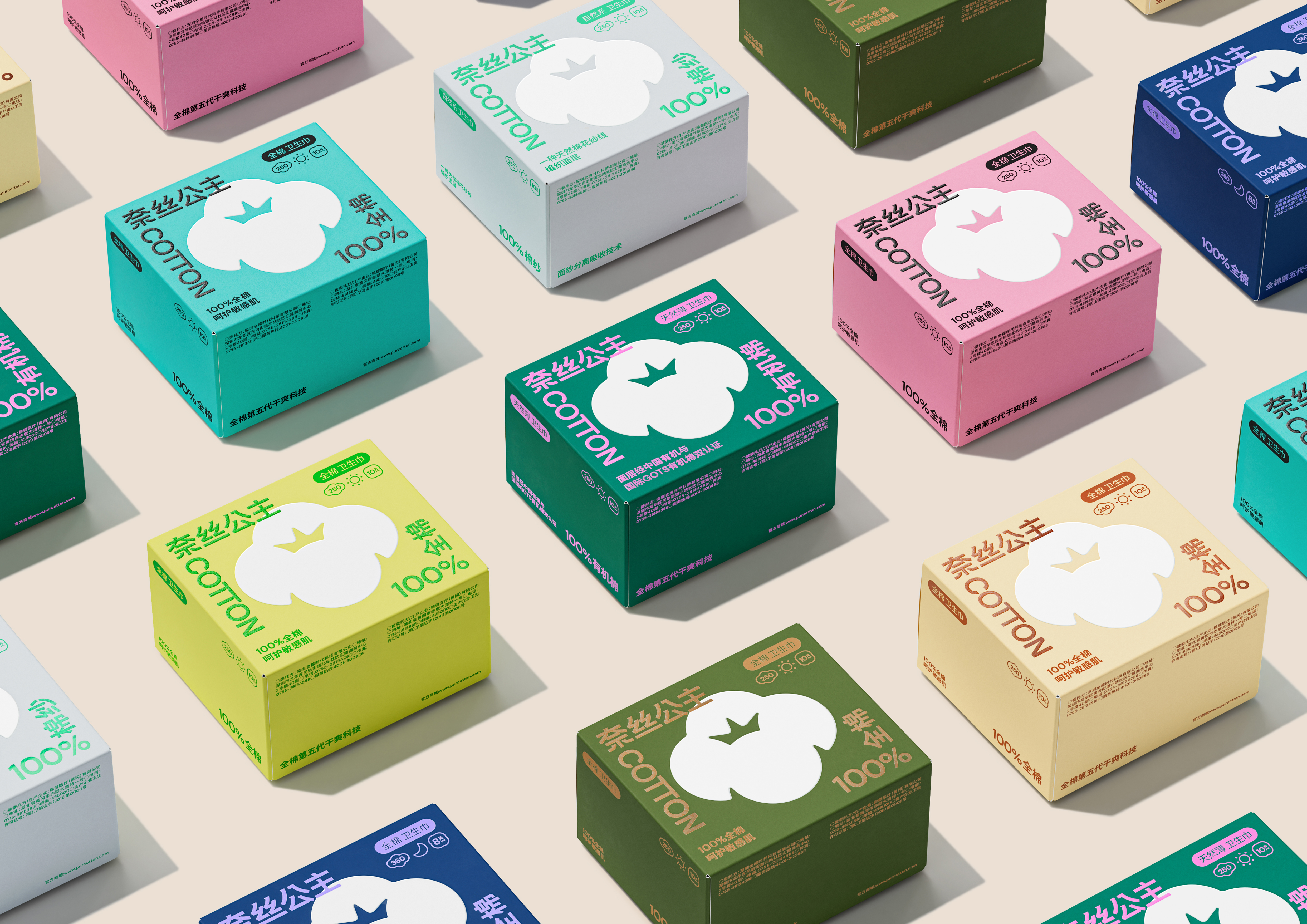
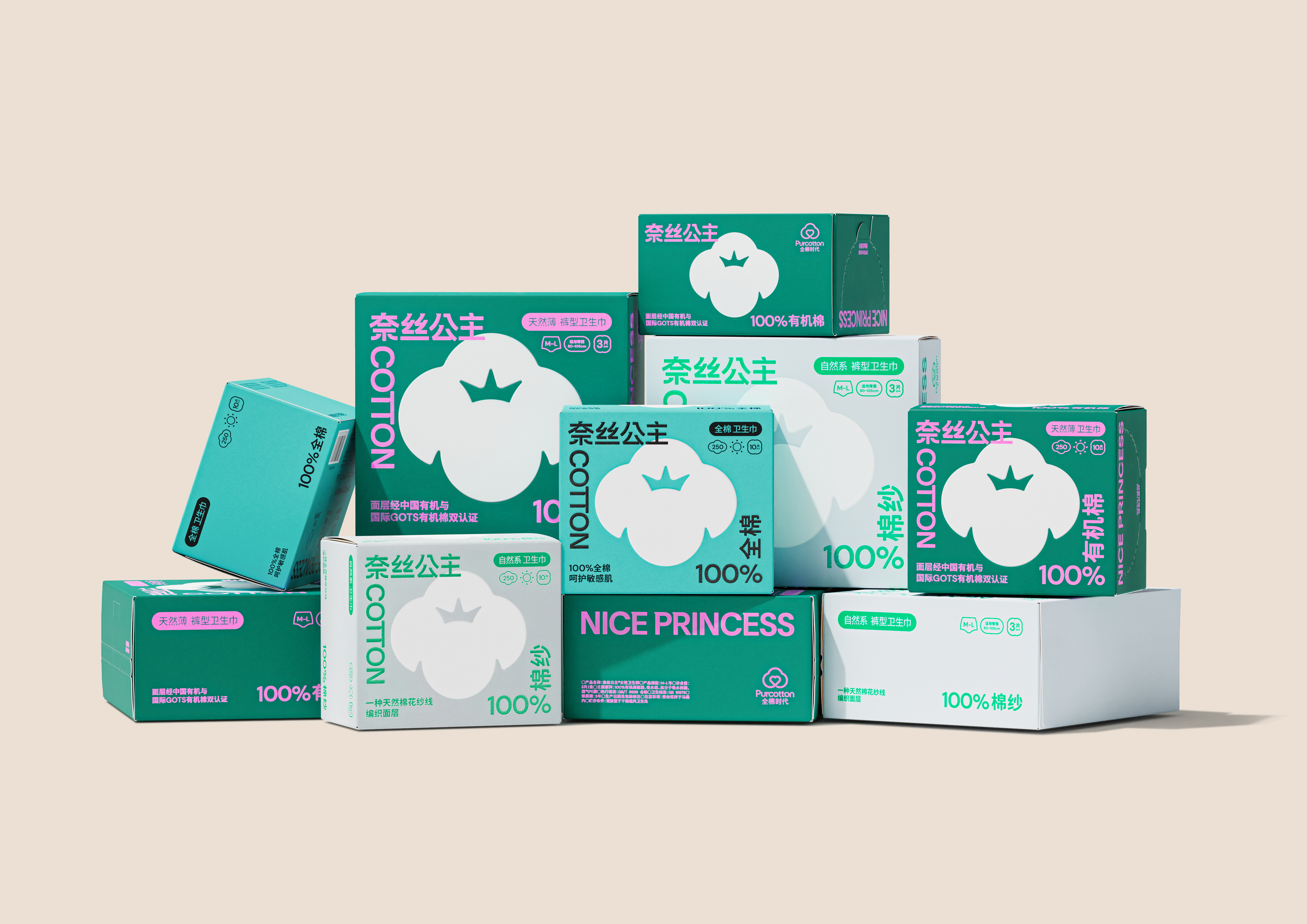
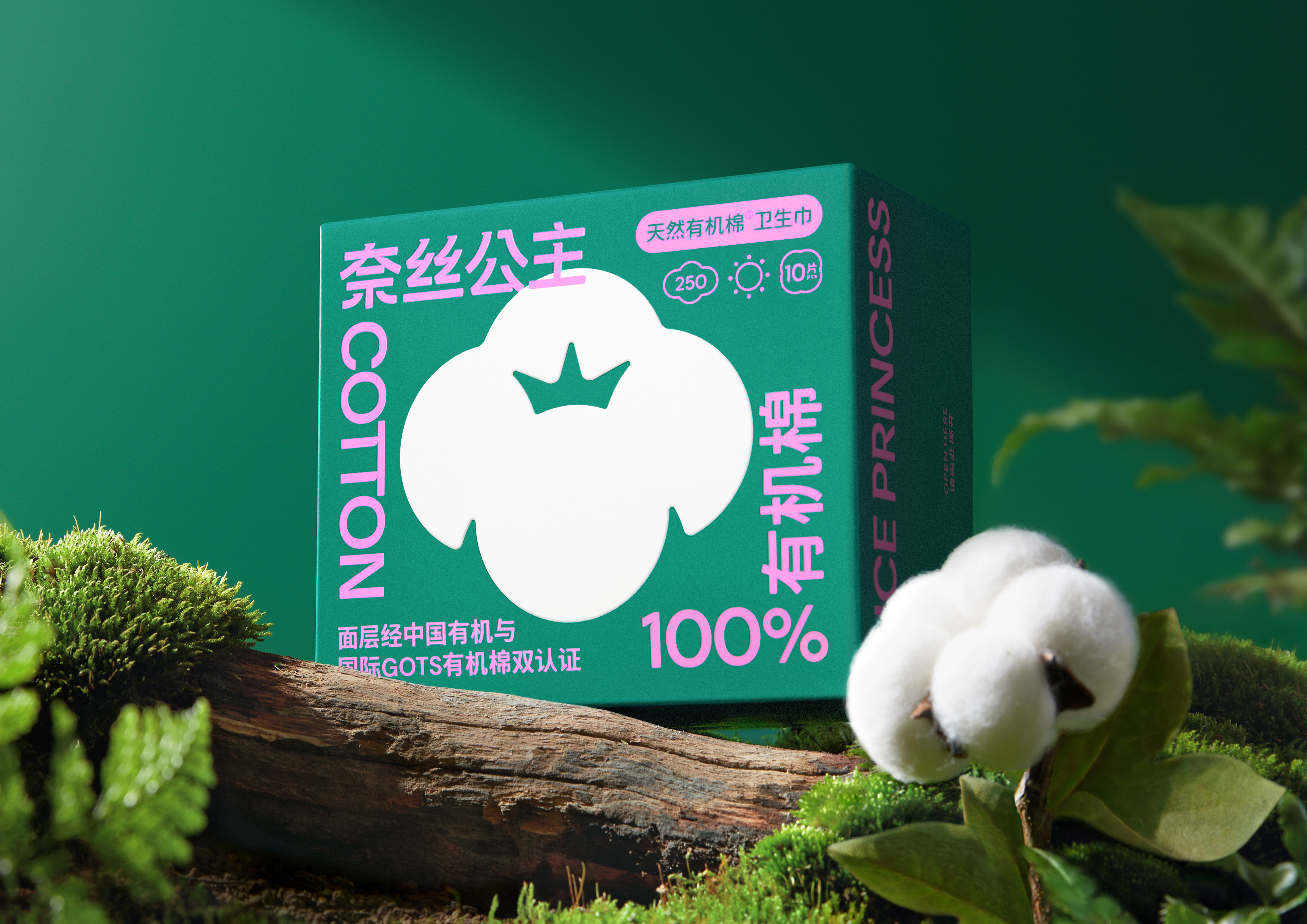
During the design phase, in order to address the issues of unclear main elements, chaotic informations, and outdated style in previous packaging, we simplified Nice Princess’s new visual system into three levels: symbol, information and colors. Firstly, based on the product characteristics of 100% cotton and the soft yet powerful brand spirit, we designed the exclusive identification symbol of Nice Princess. This symbol is composed of a positive shaped cotton and a negative shaped crown, which is also a visual expression of the brand name. Secondly, at the information level, we used layout and icons to layer the complex information of the sanitary pads category, so that it can be presented clearly and logically at different points of contact. The surrounding layout of brand name and product strength is also the brand identity element second only to the cotton symbol, echoing the product attributes of total care. Finally, based on the concept of natural organic and green as the main tone, we set up a diverse color matching system for the brand, which not only meets the function of distinguishing product matrices, but also makes the brand’s temperament more youthful and free, achieving the new target audience’s expectations for the visual experience of the product.
奈絲公主是全棉時代旗下的衛生巾品牌,我們與韓國團隊VIW合作完成了它的品牌更新。
依托全棉時代母公司穩健醫療強大的原材料技術,奈絲公主成爲了衛生巾品類中唯壹冠以100%全棉的品牌,其産品在用戶心中留下了舒適的、天然的印象,這也決定了其高端的市場定位。然而,奈絲公主先前的品牌形象和業內其他中低端品牌並無差別,無法體現其産品競爭力和與之相匹配的審美格調。在新消費訴求的推動下,奈絲公主聚焦年輕客群,圍繞産品包裝對品牌形象進行全面升級。
項目策略階段,我們針對奈絲公主的産品優勢和年輕受衆的價值取向,總結了溫柔的、有力的、本真的三個體現品牌內核的關鍵詞,並提出了溫柔而有力量的品牌精神。
項目設計階段,爲了解決品牌原包裝設計主次不明、內容混亂、風格陳舊的問題,我們將奈絲公主的新視覺系統簡化爲三個層級:符號、信息和顔色。首先,我們基于100%全棉的産品特色和溫柔而有力量的品牌精神,提煉了奈絲公主的專屬識別符號,這個符號由正形的棉花和負形的皇冠構成,亦是對品牌名稱的視覺化表達;其次在信息層面,我們用版式和圖標對該品類産品複雜的信息內容進行分層,使其在不同觸點中都能保持清晰的、有邏輯的呈現,其中品牌名和産品力的環繞式布局,也是僅次于棉花符號的品牌識別元素,呼應了全面呵護的産品特質;最後,我們以天然有機爲概念、以綠色爲主基調,爲品牌設定了壹套多元的配色系統,在滿足區分産品矩陣的功能外,也使整個品牌氣質更顯年輕和自由,達到新的目標受衆對産品視覺體驗的預期。
Relying on the powerful raw material technology of Winner Medical, the parent company of Purcotton, Nice Princess has become the only brand in the sanitary pads category labeled as 100% cotton. Its products leave a comfortable and natural impression on users, and also determine its high-end market positioning. However, the previous branding of Nice Princess is no different from other mid and low end brands in the industry, and cannot reflect its product competitiveness and matching aesthetic style. Driven by new consumer demands, Nice Princess focuses on young customers and comprehensively upgrades the brand visual around product packaging.
In the strategy phase, we summarized three key words that reflect the core of the brand: soft, powerful, and nature, based on the product advantages of Nice Princess and the value orientation of young audiences, and proposed the brand spirit - soft yet powerful.
During the design phase, in order to address the issues of unclear main elements, chaotic informations, and outdated style in previous packaging, we simplified Nice Princess’s new visual system into three levels: symbol, information and colors. Firstly, based on the product characteristics of 100% cotton and the soft yet powerful brand spirit, we designed the exclusive identification symbol of Nice Princess. This symbol is composed of a positive shaped cotton and a negative shaped crown, which is also a visual expression of the brand name. Secondly, at the information level, we used layout and icons to layer the complex information of the sanitary pads category, so that it can be presented clearly and logically at different points of contact. The surrounding layout of brand name and product strength is also the brand identity element second only to the cotton symbol, echoing the product attributes of total care. Finally, based on the concept of natural organic and green as the main tone, we set up a diverse color matching system for the brand, which not only meets the function of distinguishing product matrices, but also makes the brand’s temperament more youthful and free, achieving the new target audience’s expectations for the visual experience of the product.
奈絲公主是全棉時代旗下的衛生巾品牌,我們與韓國團隊VIW合作完成了它的品牌更新。
依托全棉時代母公司穩健醫療強大的原材料技術,奈絲公主成爲了衛生巾品類中唯壹冠以100%全棉的品牌,其産品在用戶心中留下了舒適的、天然的印象,這也決定了其高端的市場定位。然而,奈絲公主先前的品牌形象和業內其他中低端品牌並無差別,無法體現其産品競爭力和與之相匹配的審美格調。在新消費訴求的推動下,奈絲公主聚焦年輕客群,圍繞産品包裝對品牌形象進行全面升級。
項目策略階段,我們針對奈絲公主的産品優勢和年輕受衆的價值取向,總結了溫柔的、有力的、本真的三個體現品牌內核的關鍵詞,並提出了溫柔而有力量的品牌精神。
項目設計階段,爲了解決品牌原包裝設計主次不明、內容混亂、風格陳舊的問題,我們將奈絲公主的新視覺系統簡化爲三個層級:符號、信息和顔色。首先,我們基于100%全棉的産品特色和溫柔而有力量的品牌精神,提煉了奈絲公主的專屬識別符號,這個符號由正形的棉花和負形的皇冠構成,亦是對品牌名稱的視覺化表達;其次在信息層面,我們用版式和圖標對該品類産品複雜的信息內容進行分層,使其在不同觸點中都能保持清晰的、有邏輯的呈現,其中品牌名和産品力的環繞式布局,也是僅次于棉花符號的品牌識別元素,呼應了全面呵護的産品特質;最後,我們以天然有機爲概念、以綠色爲主基調,爲品牌設定了壹套多元的配色系統,在滿足區分産品矩陣的功能外,也使整個品牌氣質更顯年輕和自由,達到新的目標受衆對産品視覺體驗的預期。


*部分樣式以實際售賣爲准