Fein
Branding, Packaging, 2022
Creative Director: Alex
Art Director: Alex
Designer: Alex, Hawk
Client: Fein Coffee
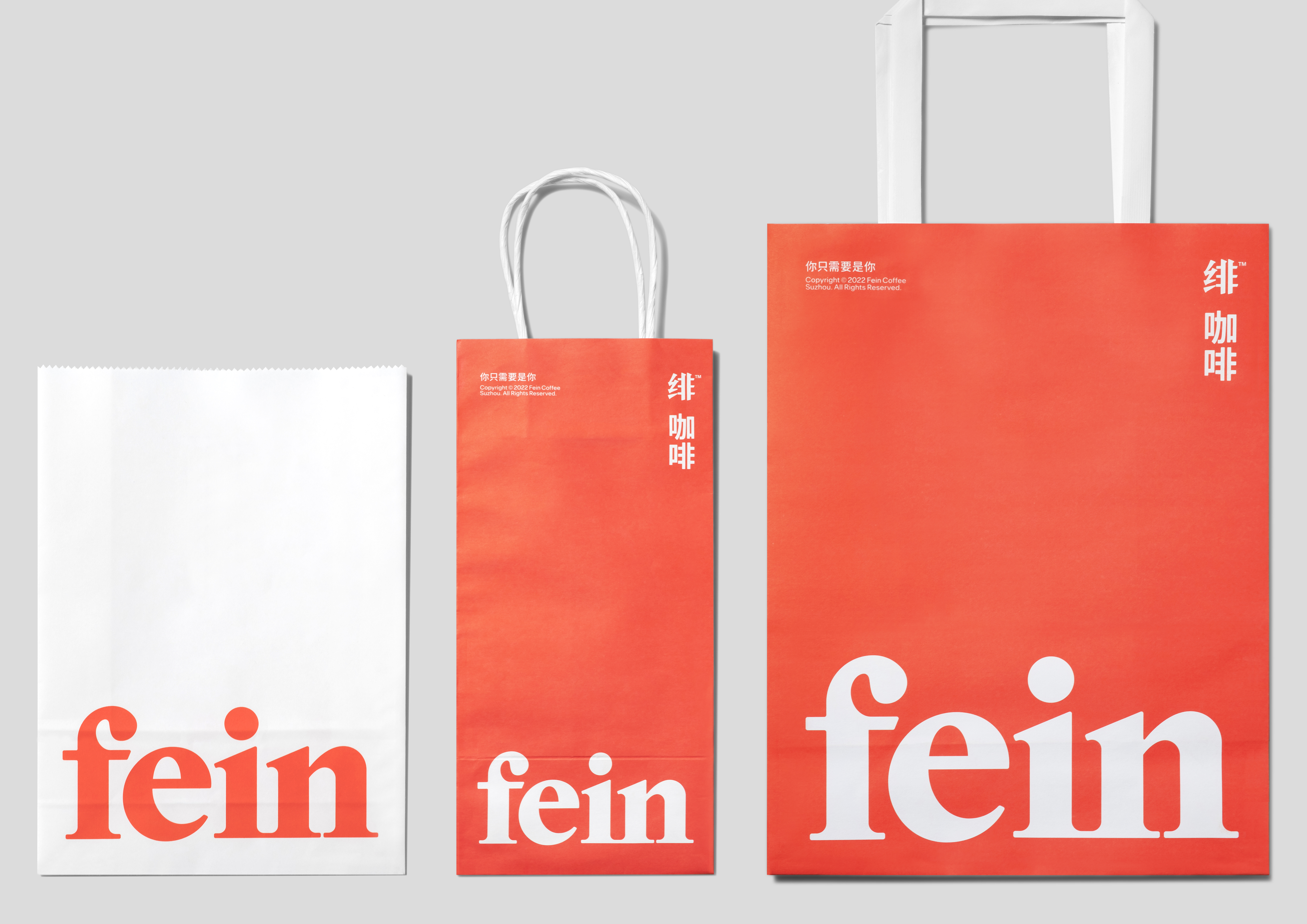
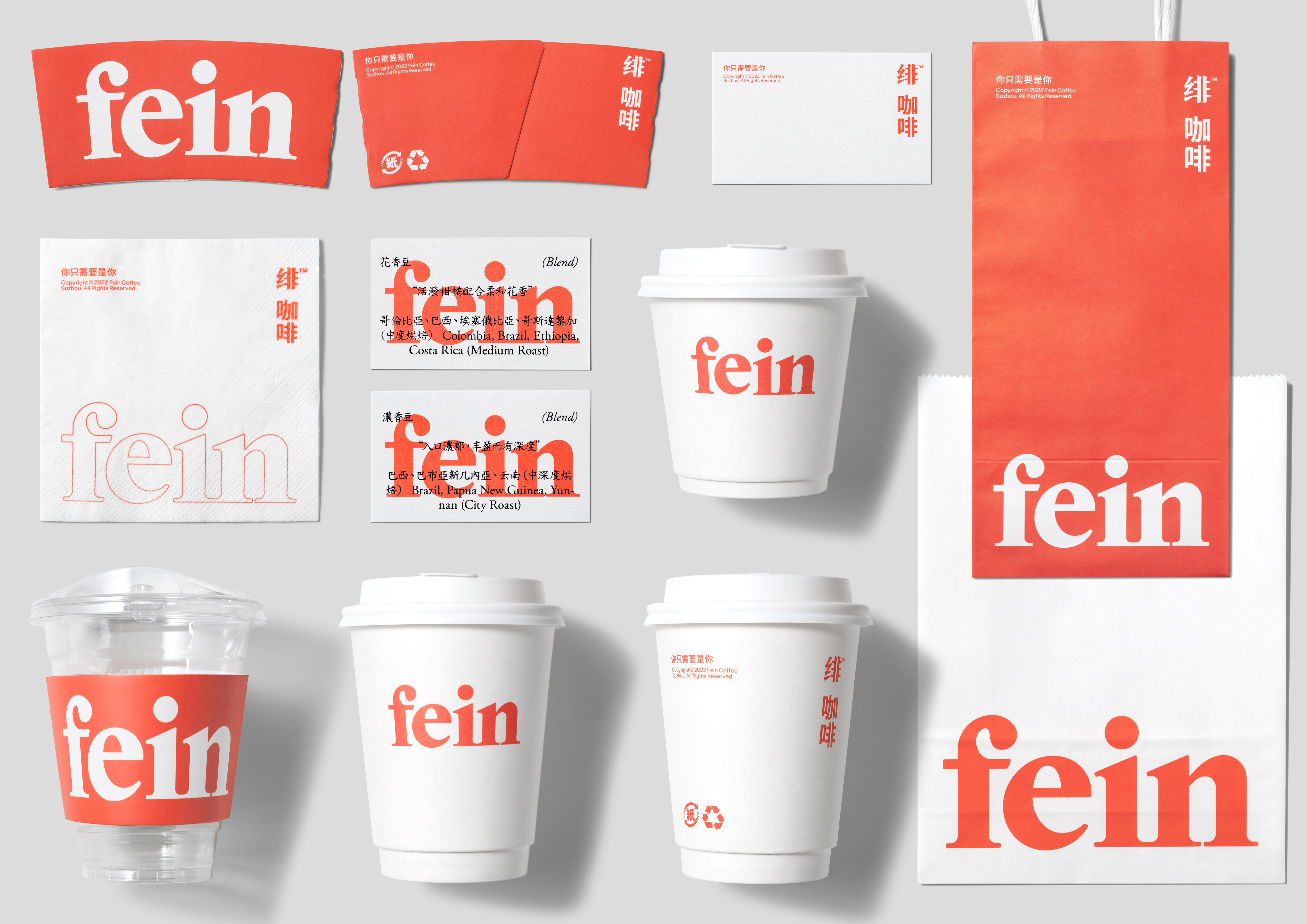
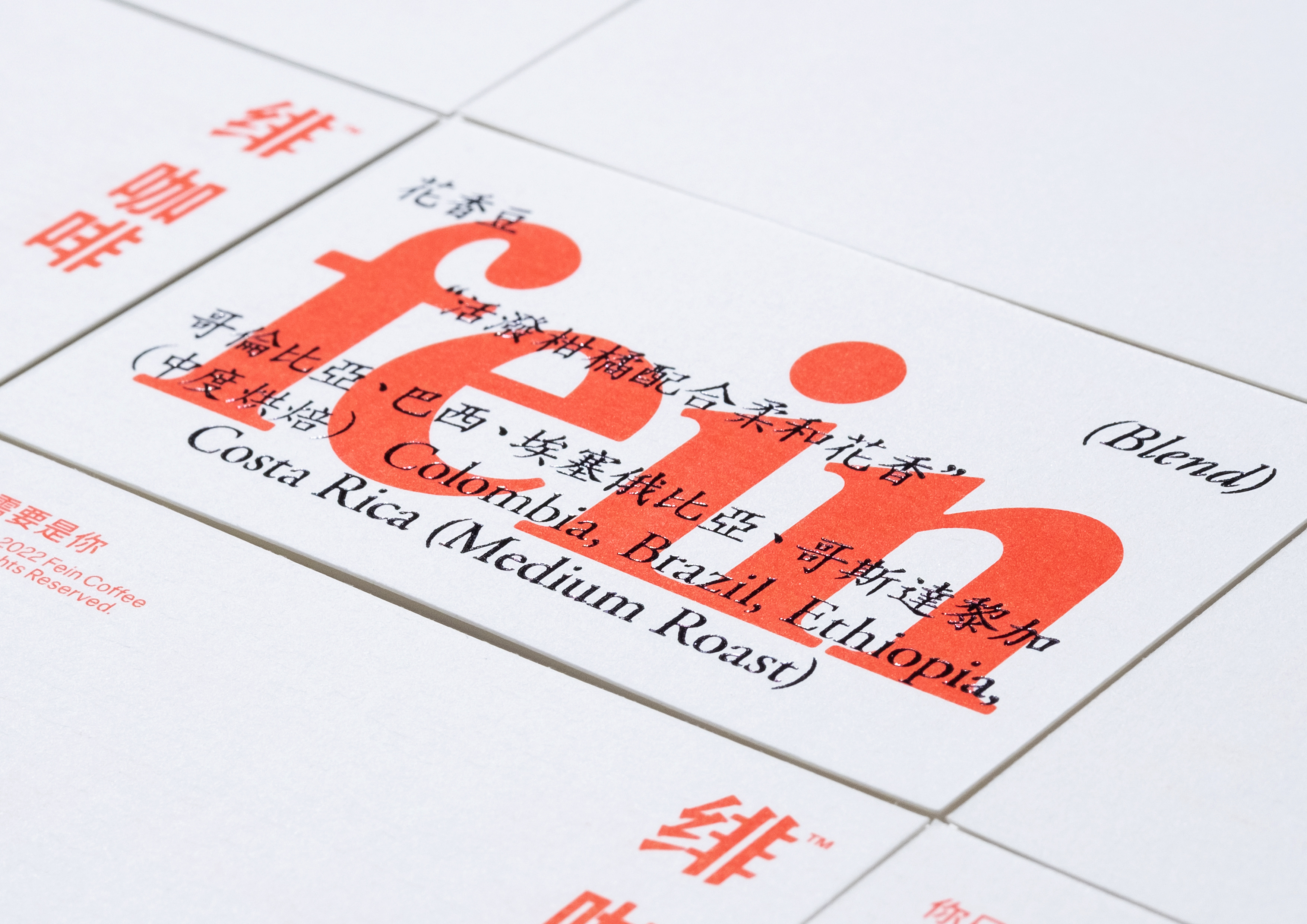
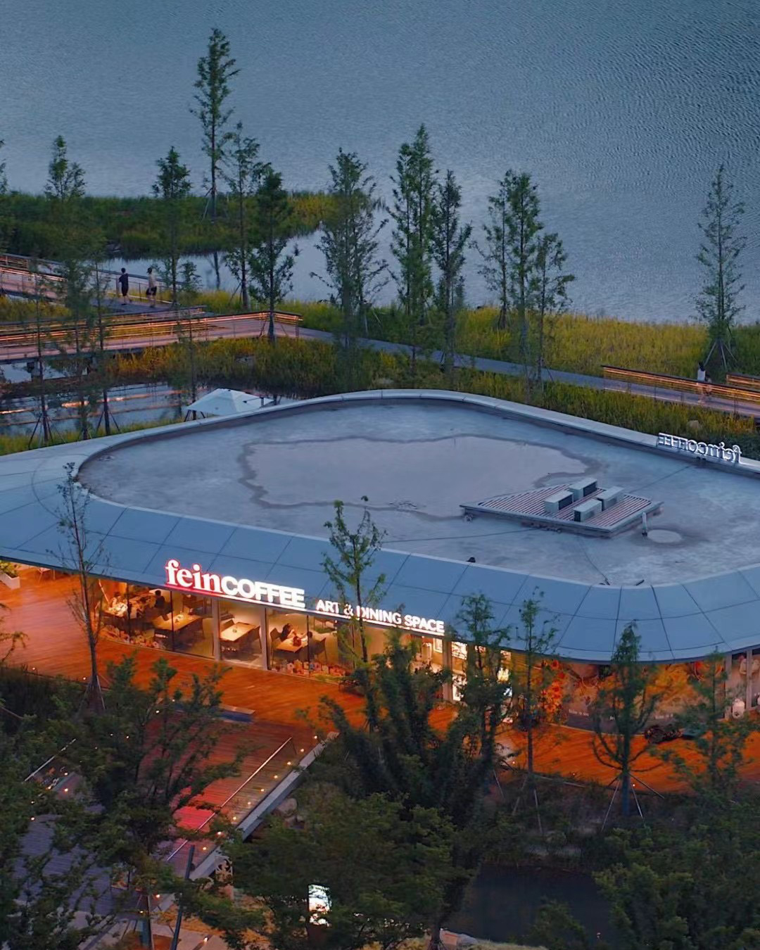
Fein Coffee is a chain coffee brand born in
the ancient city of Suzhou. The brand stands on the female perspective conveys
warmth and care, and advocates an independent and exquisite attitude towards
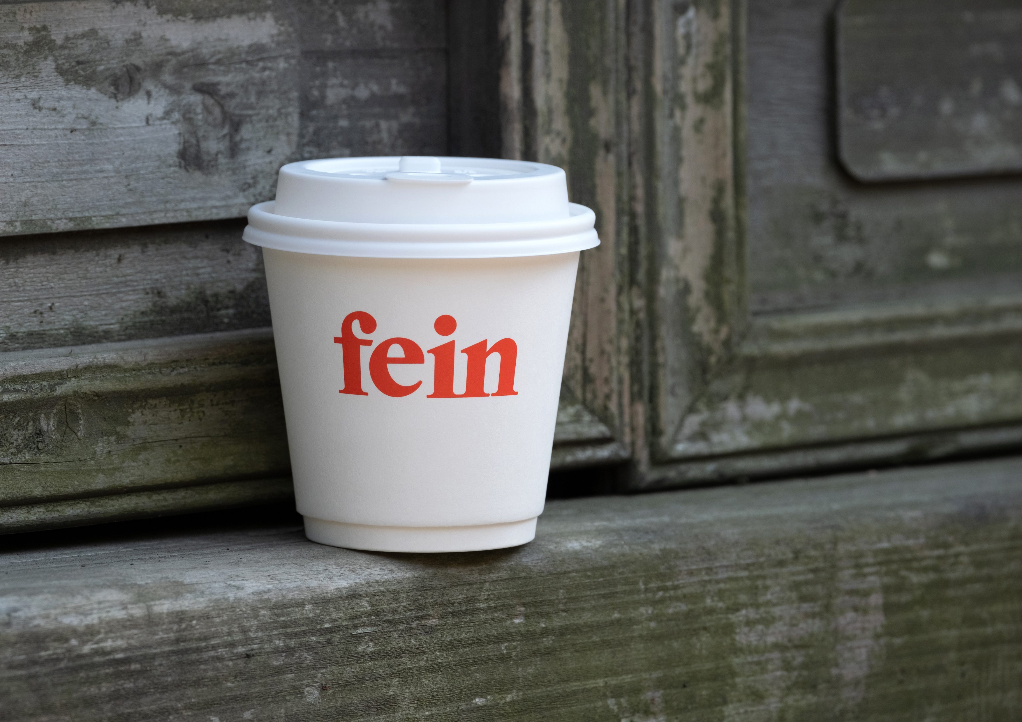
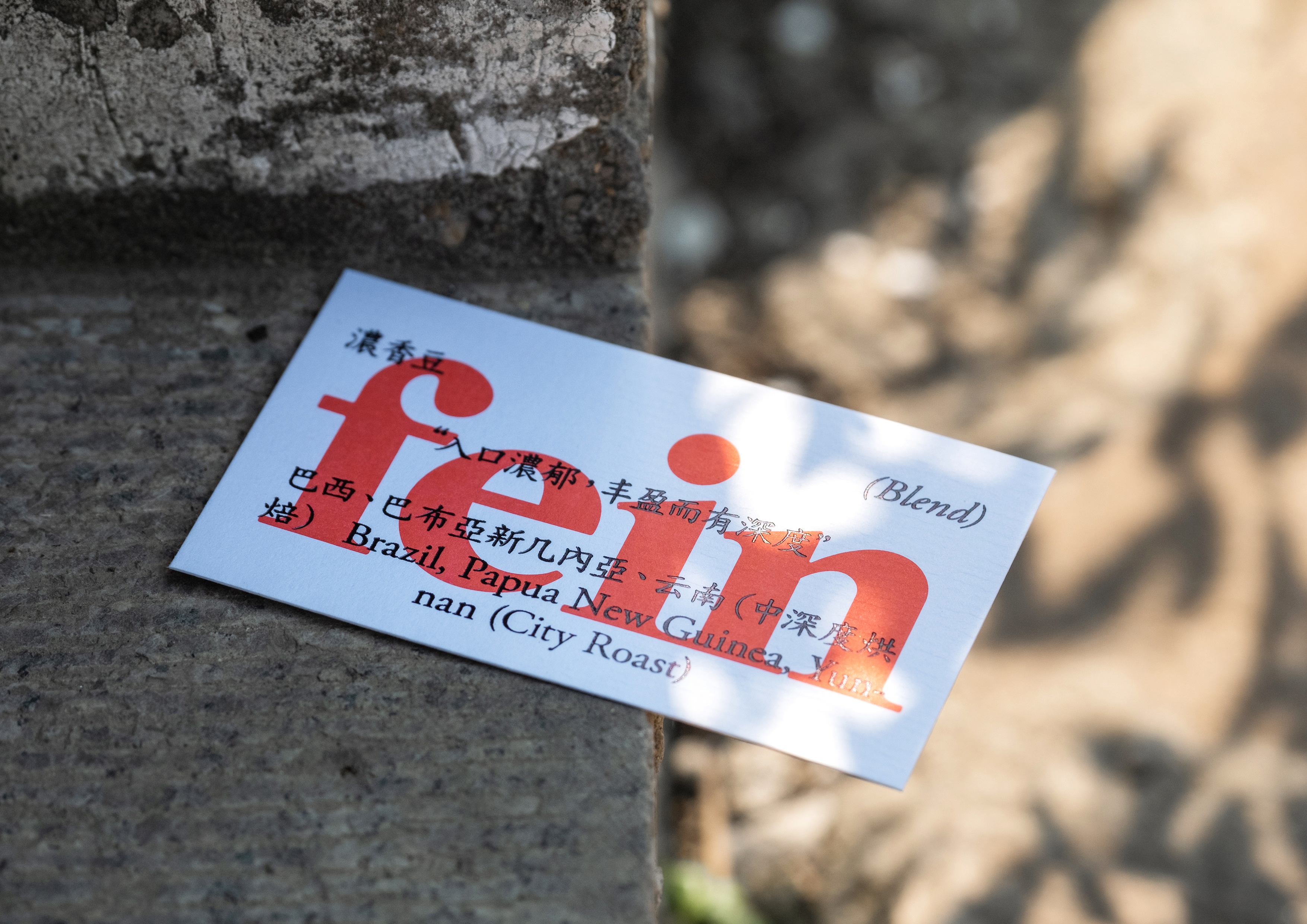
life. We started with the brand name Fein and turned it into an tender and
confident declaration by using highly readable serif type design, which was
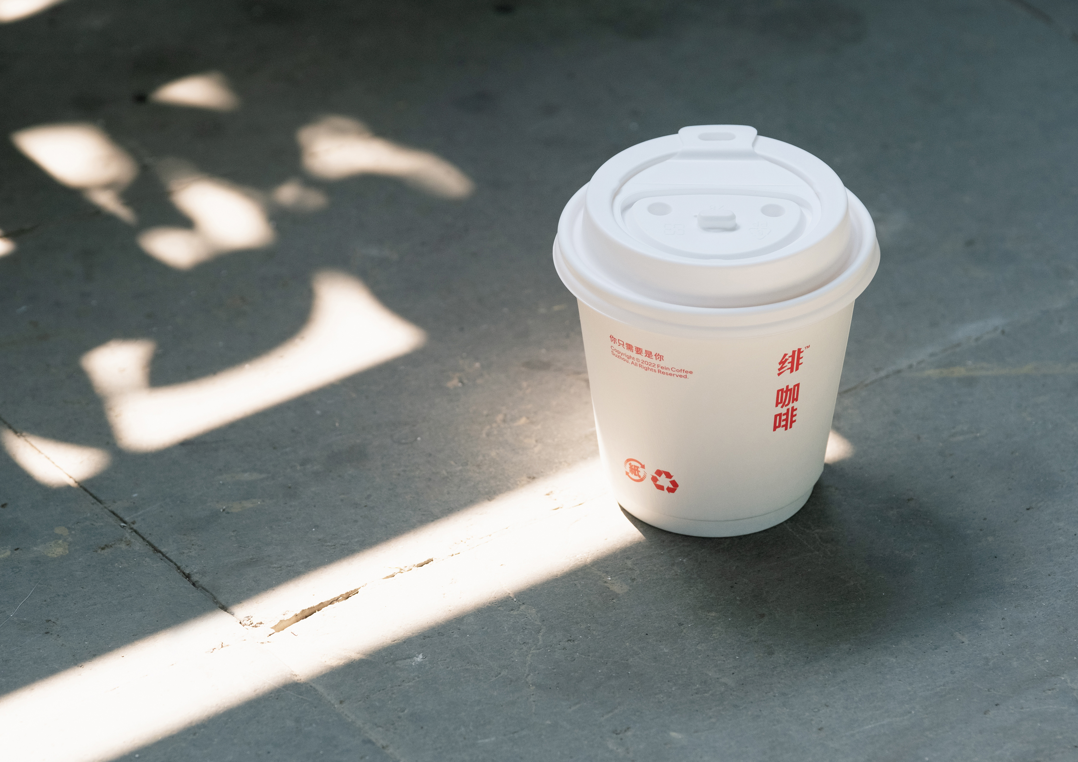
spread in consumers. In order to make the regional characteristics of Jiangnan
brand compatible with the characteristics of foreign products the brand visual
system makes the vertical Chinese logo, horizontal English logo, humanistic and
ancient text and different images blend harmoniously through the setting of
fixed form.
緋咖啡是一個誕生於古城蘇州的連鎖咖啡品牌,品牌以女性視角出發,傳遞溫暖與關懷,並主張獨立且精致的生活態度。我們從品牌名稱Fein切入,通過高易讀性的襯線字體設計,讓其成為一個親切又自信的宣言,在社群中傳播。為了兼容品牌的江南地域特征和產品的外來屬性,品牌的視覺系統通過固定結構的設置,讓豎排版的中文標誌、橫排版的英文標誌、人文古樸的文本和不同的圖像和諧相融。