Complexity and Simplicity
Poster, Typeface, Print, 2017
Creative Director: Alex
Art Director: Alex
Designer: Alex
Client: Biennial of Asia Graphic Design
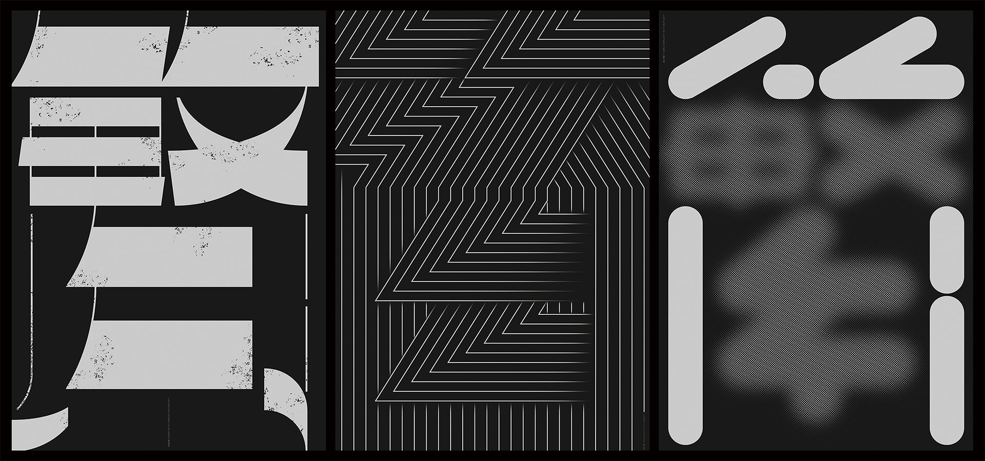
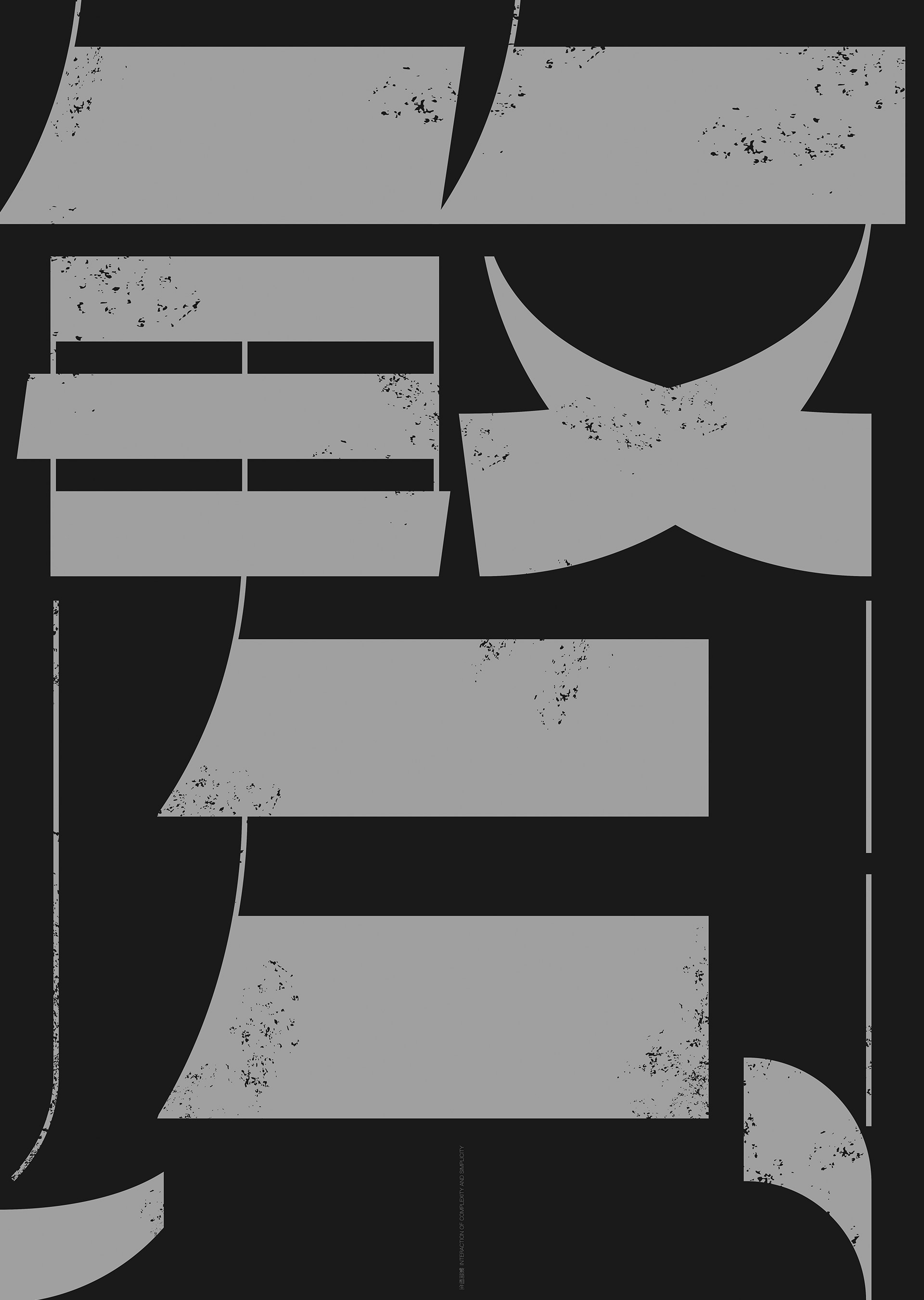
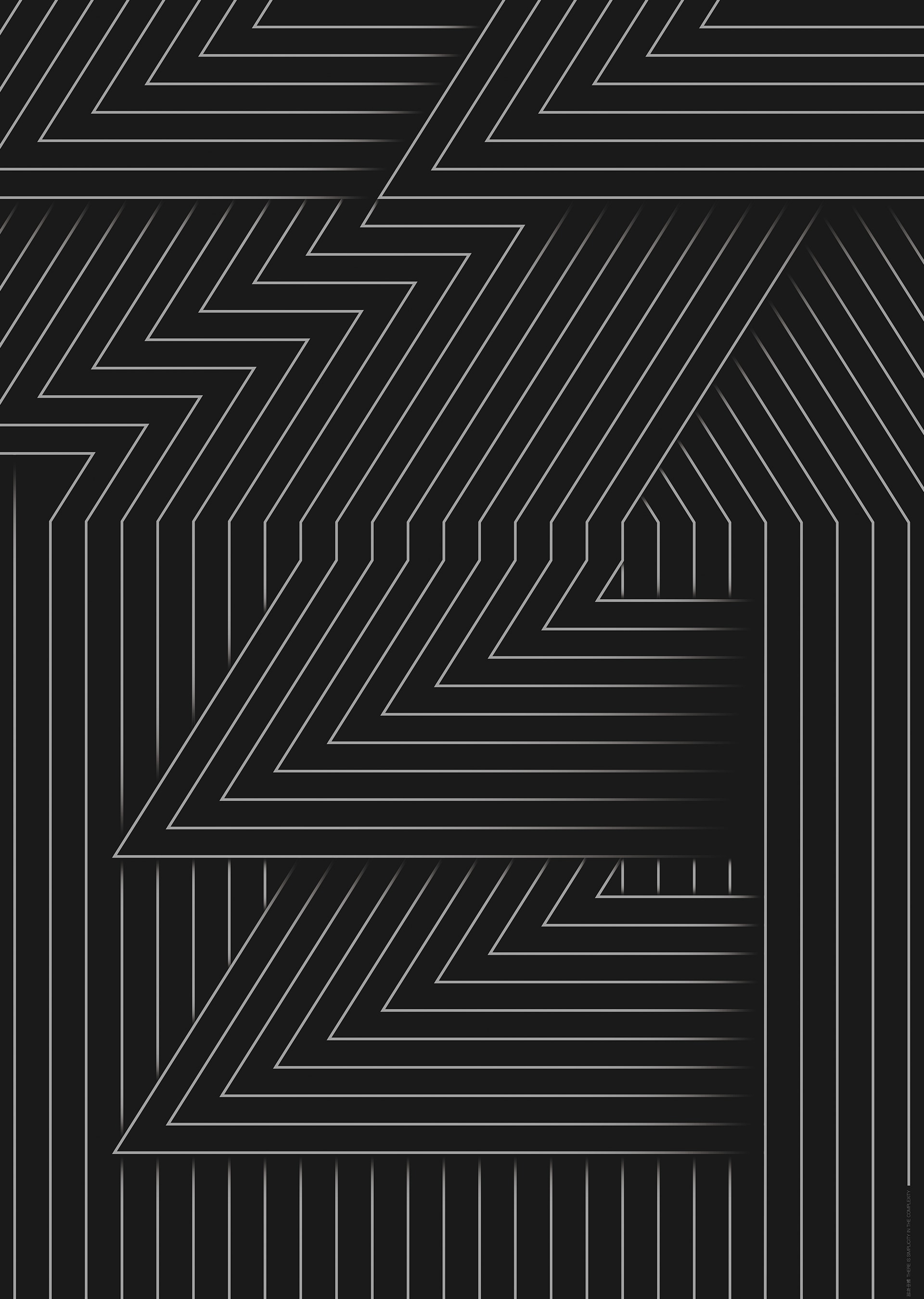
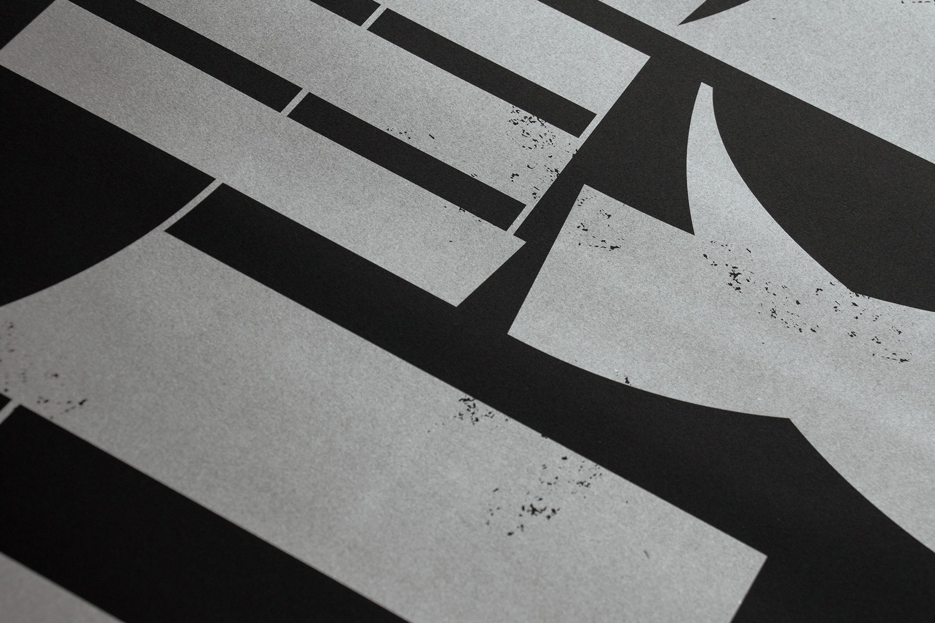
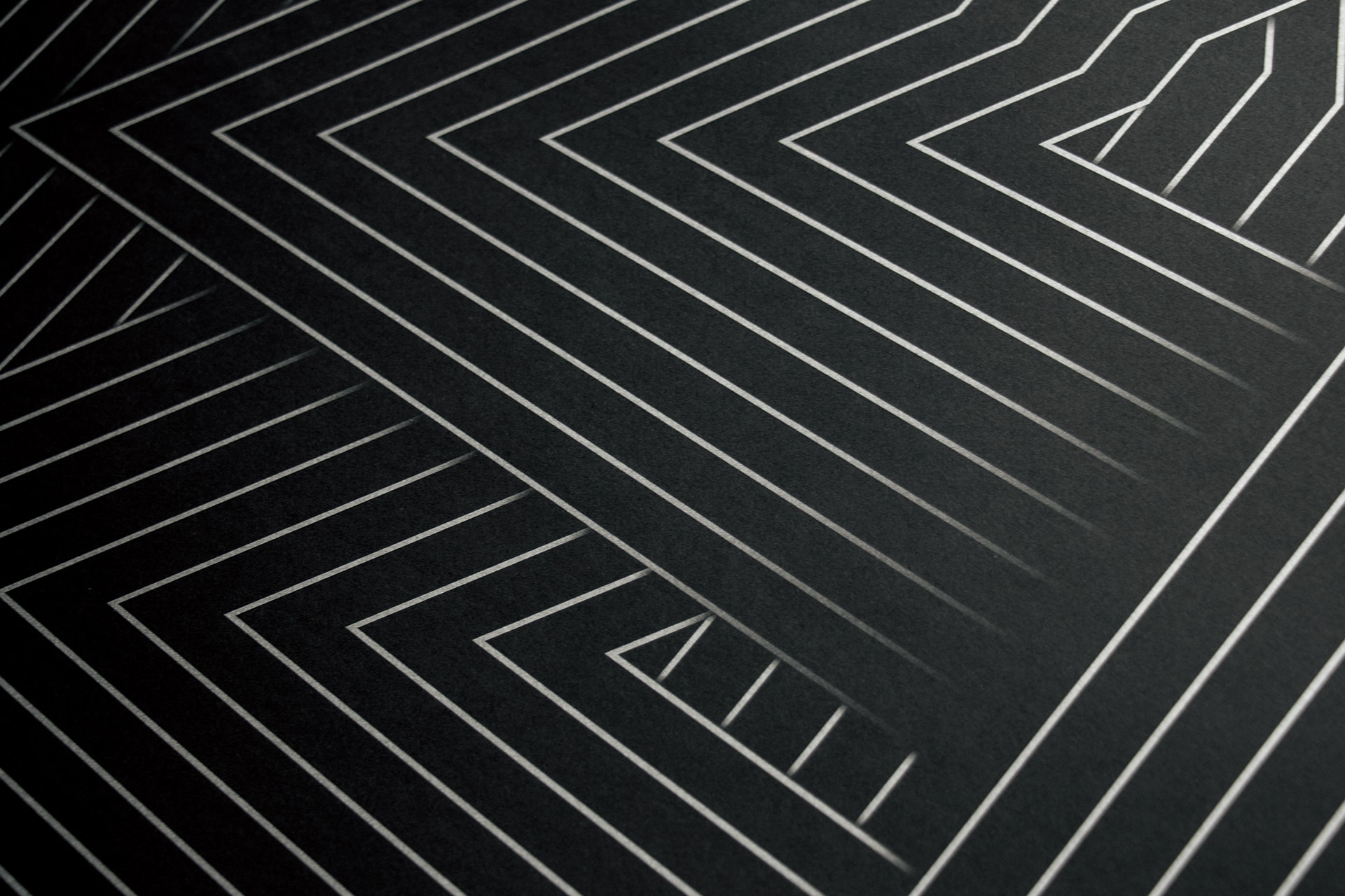
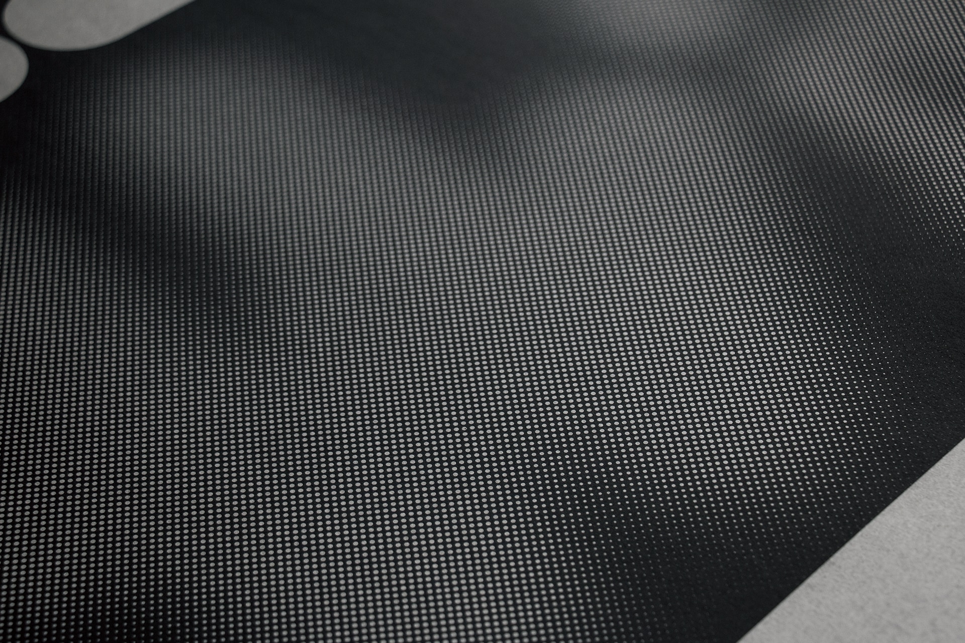
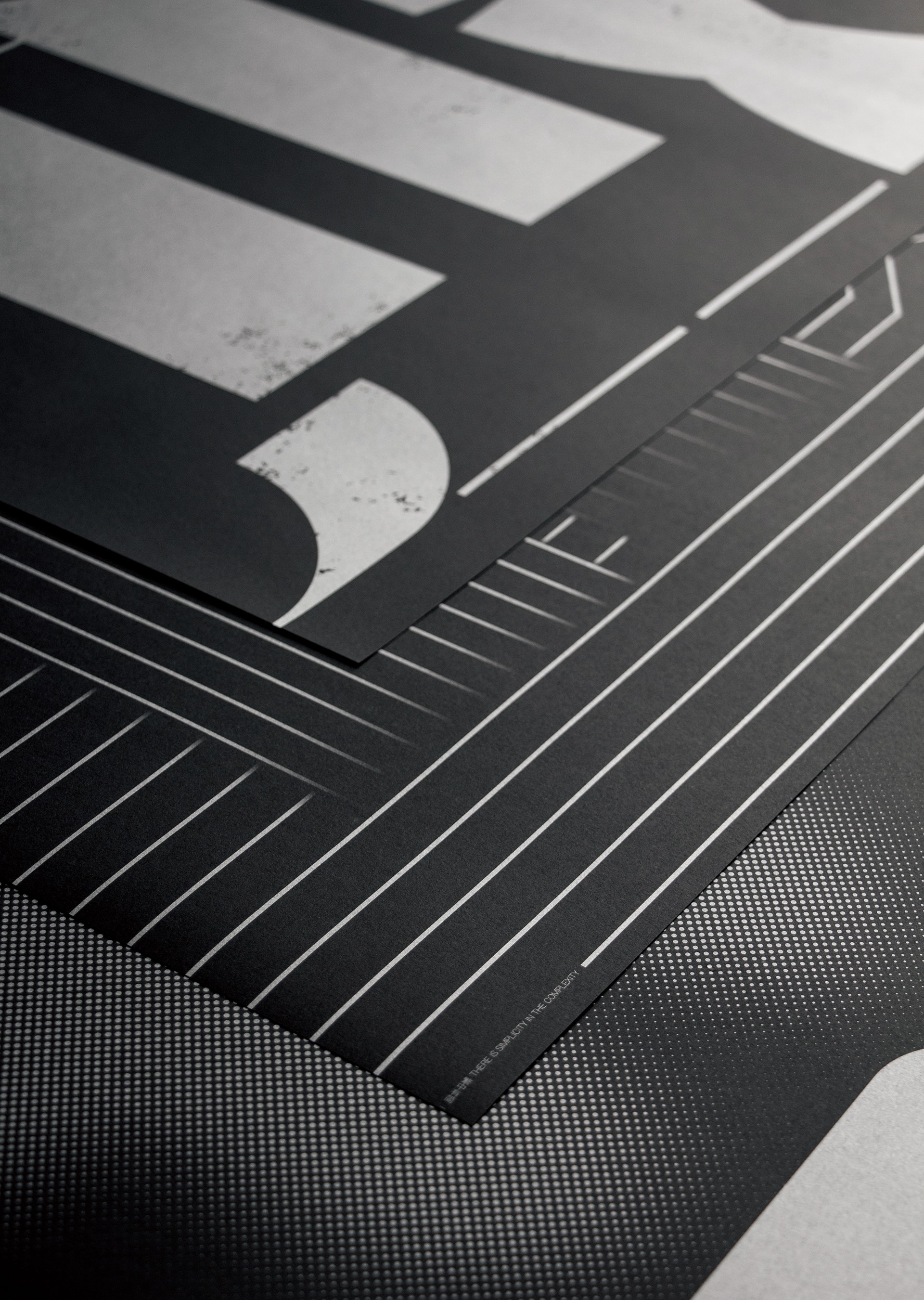
Complexity and Simplicity are series typography posters about the philosophy between complexity and simplicity. Interaction of Complexity and Simplicity - The balance of yin and yang can create all things, there is also a symbiosis between complexity and simplicity. The poster is shown in the form of typography, we can see the Chinese characters “FAN” and “JIAN” in the same image by the contrast of wide and fine shapes. I want to convey the philosophy of the symbiosis between complexity and simplicity by this poster. There is Simplicity in the Complexity - Everything has two sides, the key is to look at things from what angle. The poster is shown in the form of typography. There is a Chinese character “JIAN” in the complicated lines, the strokes of “JIAN” are from another Chinese character “FAN”. I want to convey the meaning of simplicity (JIAN) in the complexity (FAN) by this pure and repetitive technique. Turn Complexity into Simplicity - Choice is the theme of life, we want to find the simple things in the complicated world. The poster is shown in the form of typography, I change the Chinese character “FAN” into another Chinese character “JIAN” by virtual and reality shapes. The poster convey the concept of Turn Complexity (FAN) into Simplicity (JIAN). These Posters make use of the dual relationship between different graphics to extend the deeper narrative of characters and symbols. The posters are printed by silver ink on black paper.
《繁·簡》是一組表現「繁復」與「簡單」之間哲理的字體海報。繁簡相生-陰陽平衡,生成萬物,繁雜與簡一之間也存在著共生關係。海報以字體設計的形式,通過圖形的粗細對比,組合成「繁」中有「簡」,「簡」中有「繁」的畫面,傳達繁簡相生的哲理。繁中有簡-凡事都有兩面性,關鍵在以何種角度來觀察事物。海報以字體設計的形式表達,在繁雜錯亂的線條中,勾勒出漢字「簡」,同時「簡」字的筆畫都以「繁」字的筆畫構成。通過純粹反復的構成手法,傳達繁中有簡的意味。化繁為簡-有關取捨的抉擇是伴隨人生的主題,紛繁複雜的周遭需要我們靜心發現單純簡單的一面。海報以字體設計出發,通過虛實圖形,將「繁」字變化成「簡」字,簡單直接的傳遞化繁為簡的概念。海報利用不同圖形間的對偶關係,讓文字符號延伸出更深層的敘事性。