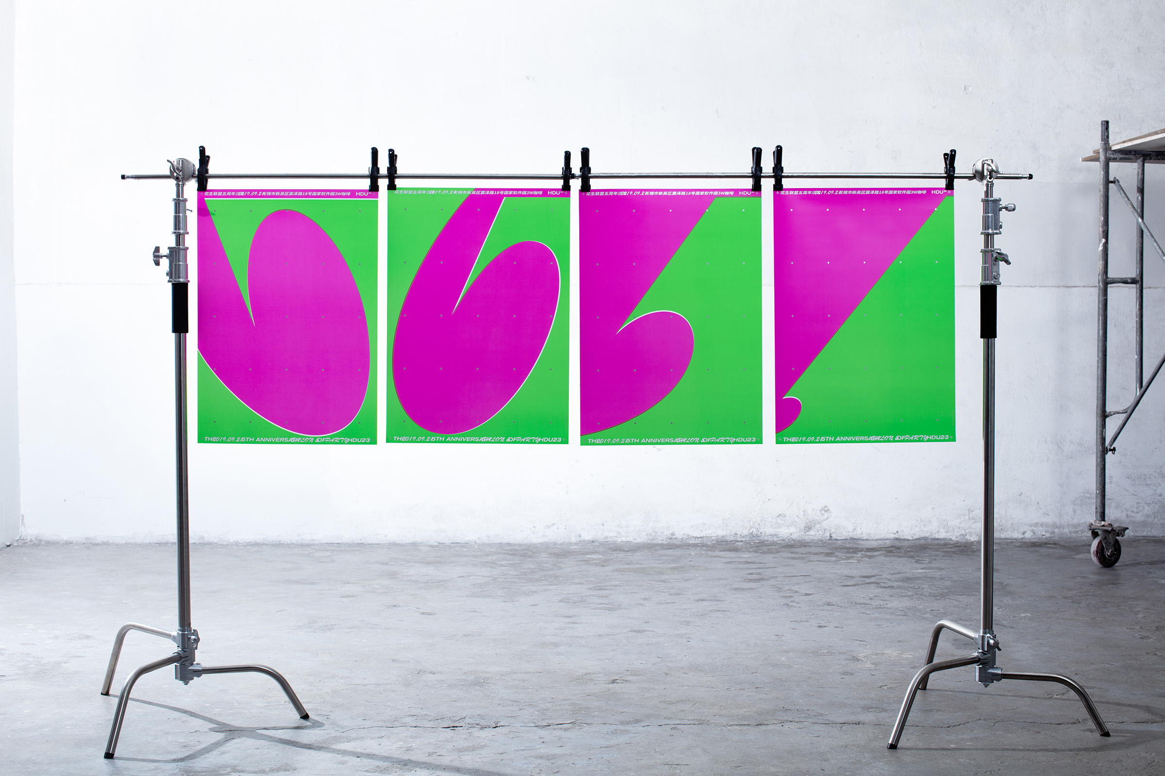
5th Anniversary of HDU23
Poster, Print, Motion, 2019
Creative Director: Alex
Art Director: Alex
Designer: Alex
Motion: Karo
Client: Horizon Design Union
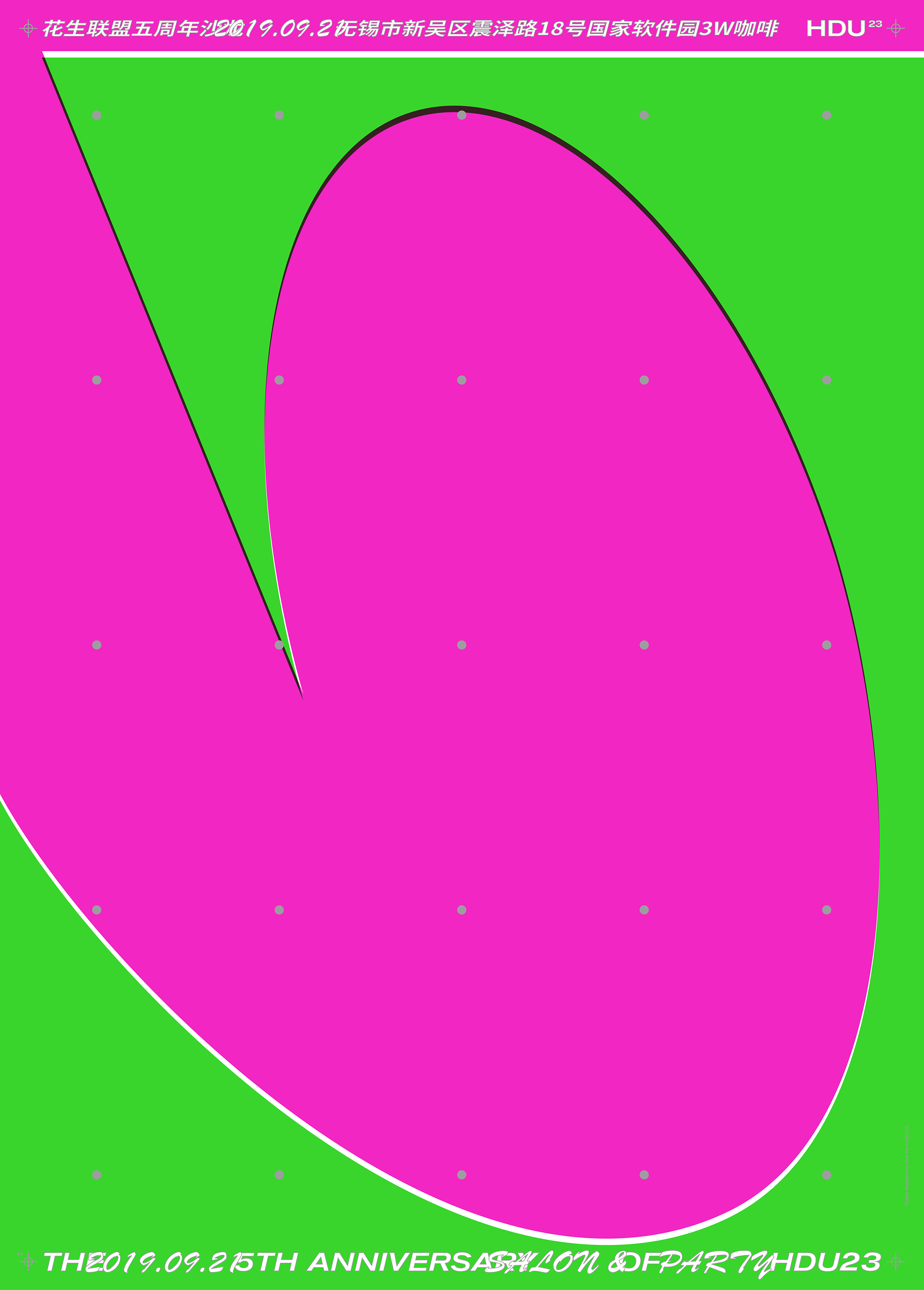
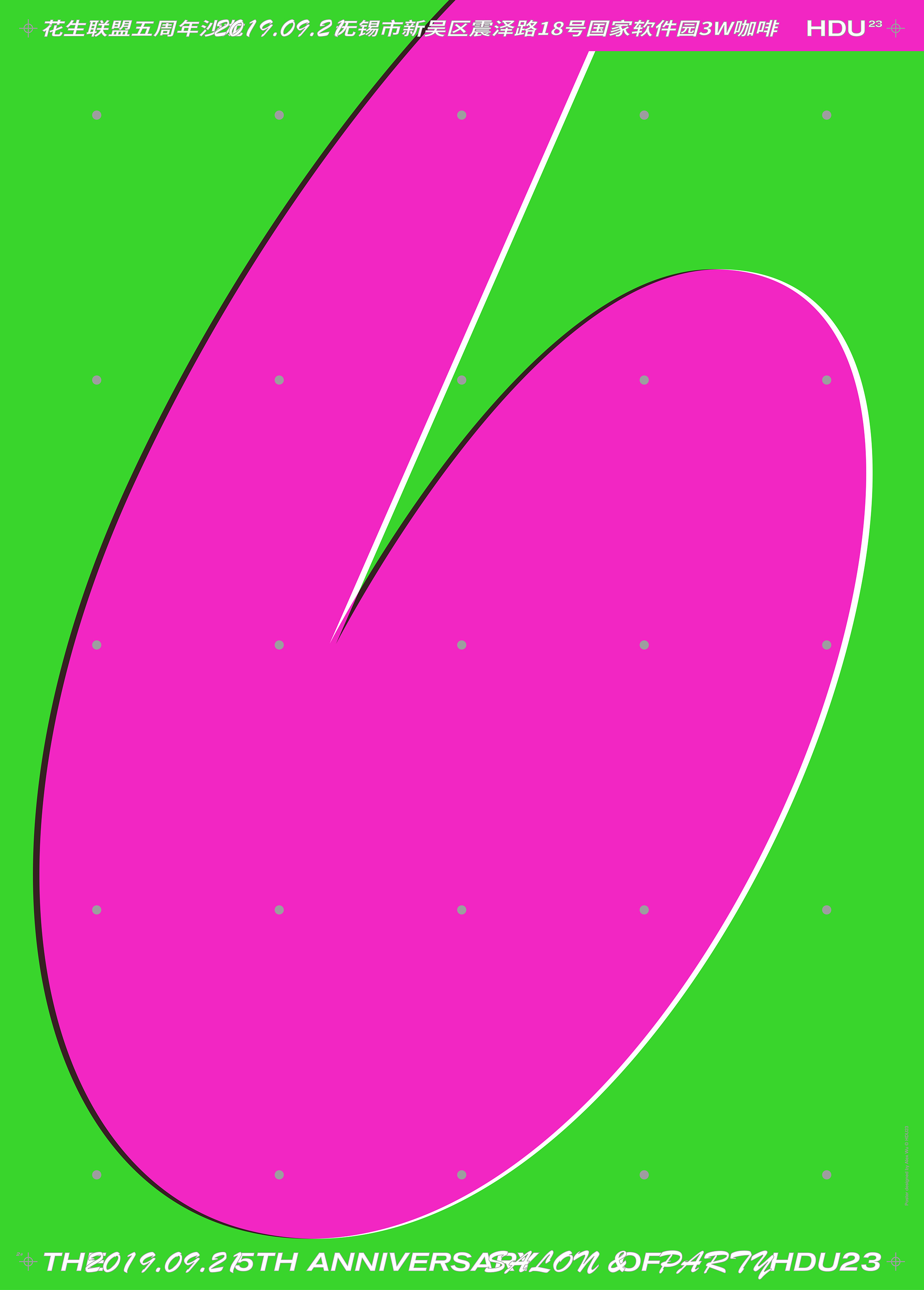
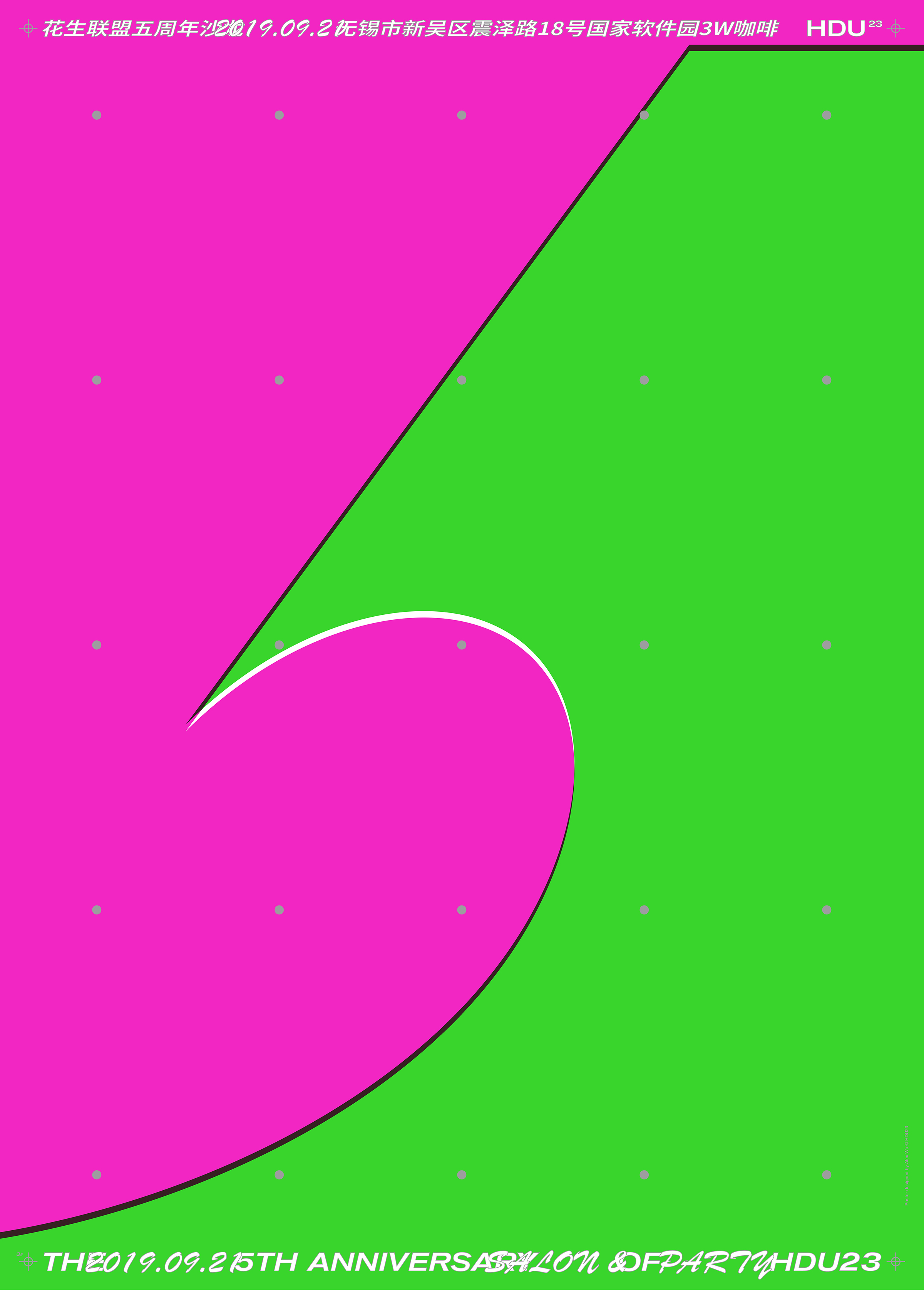
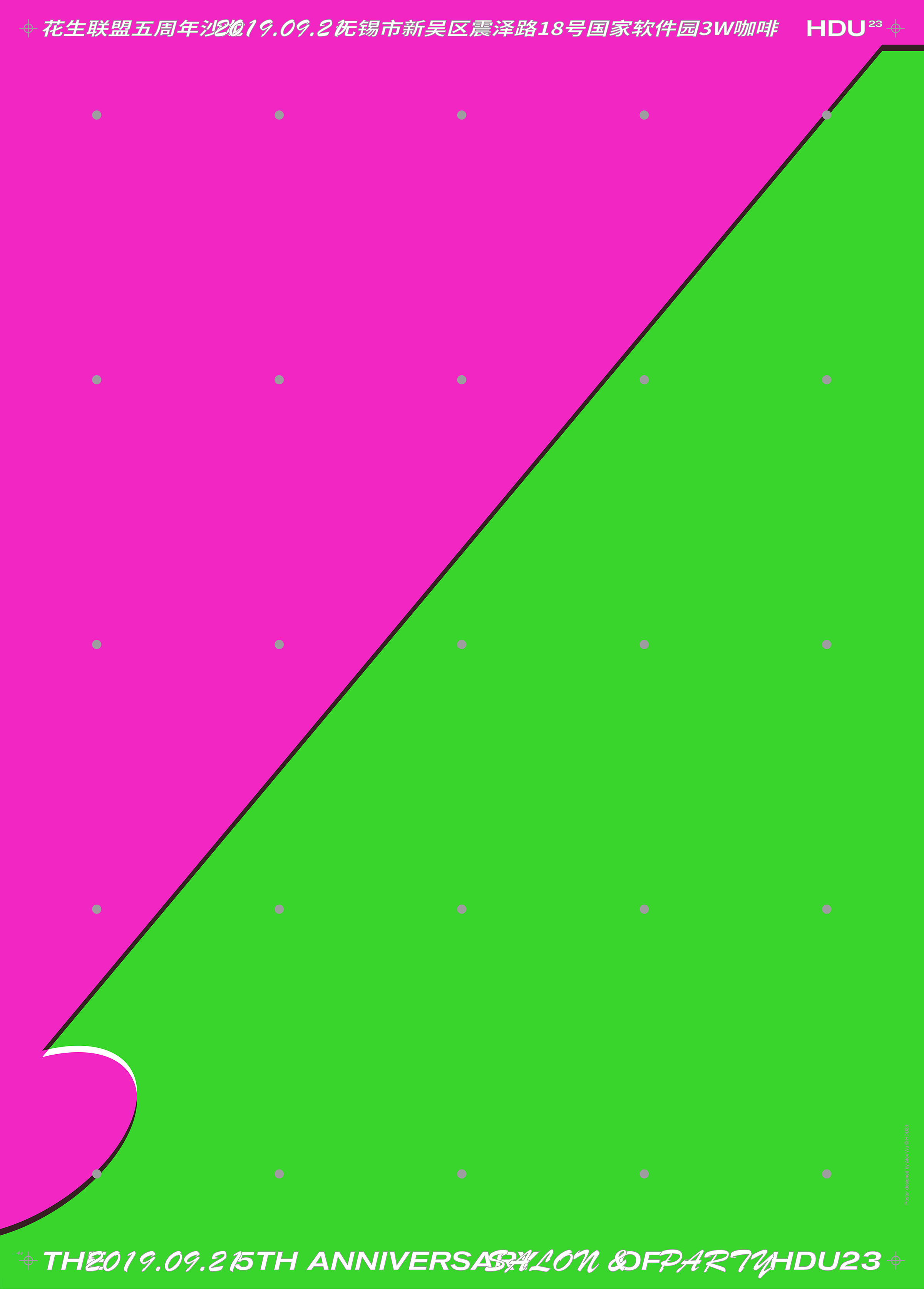
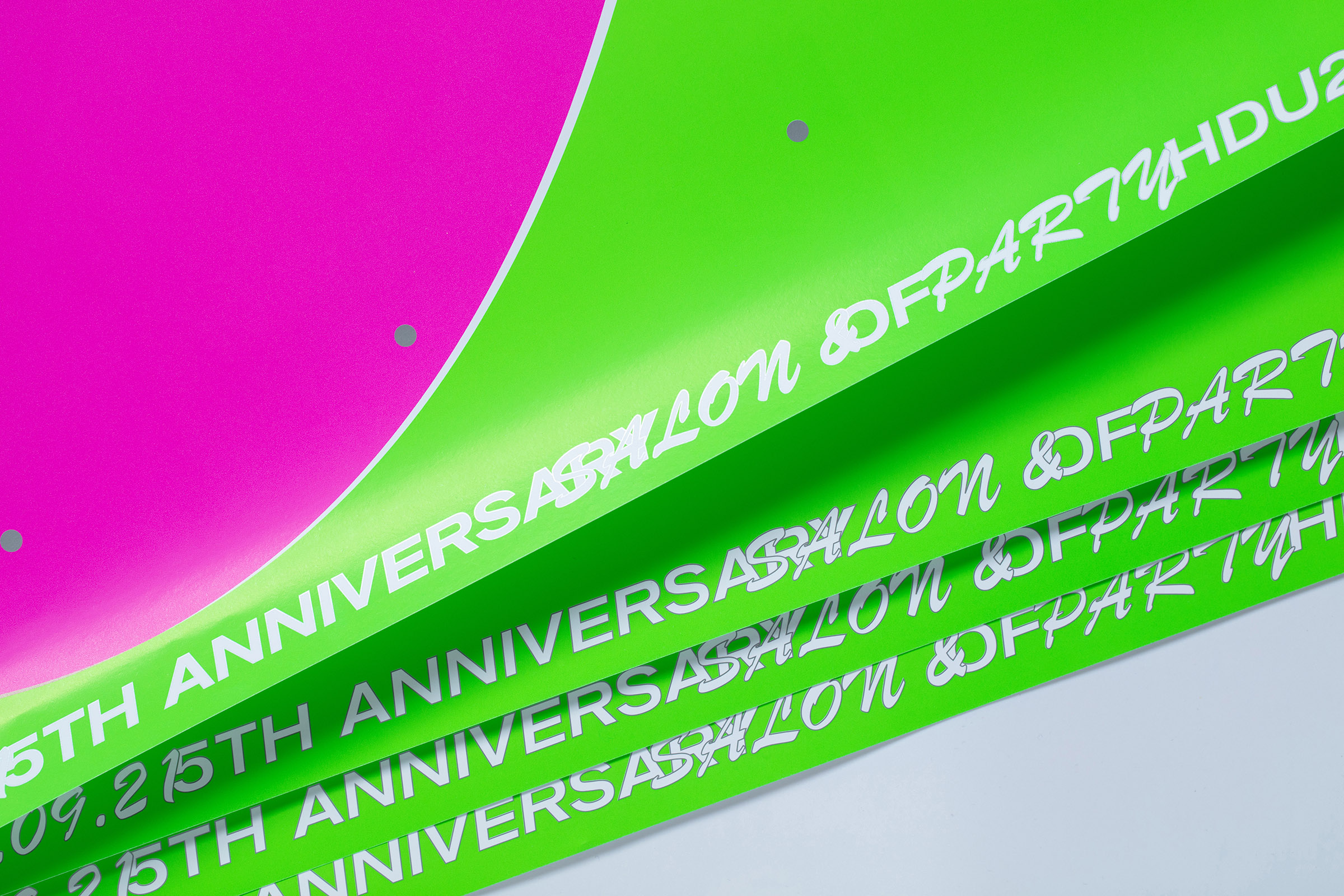
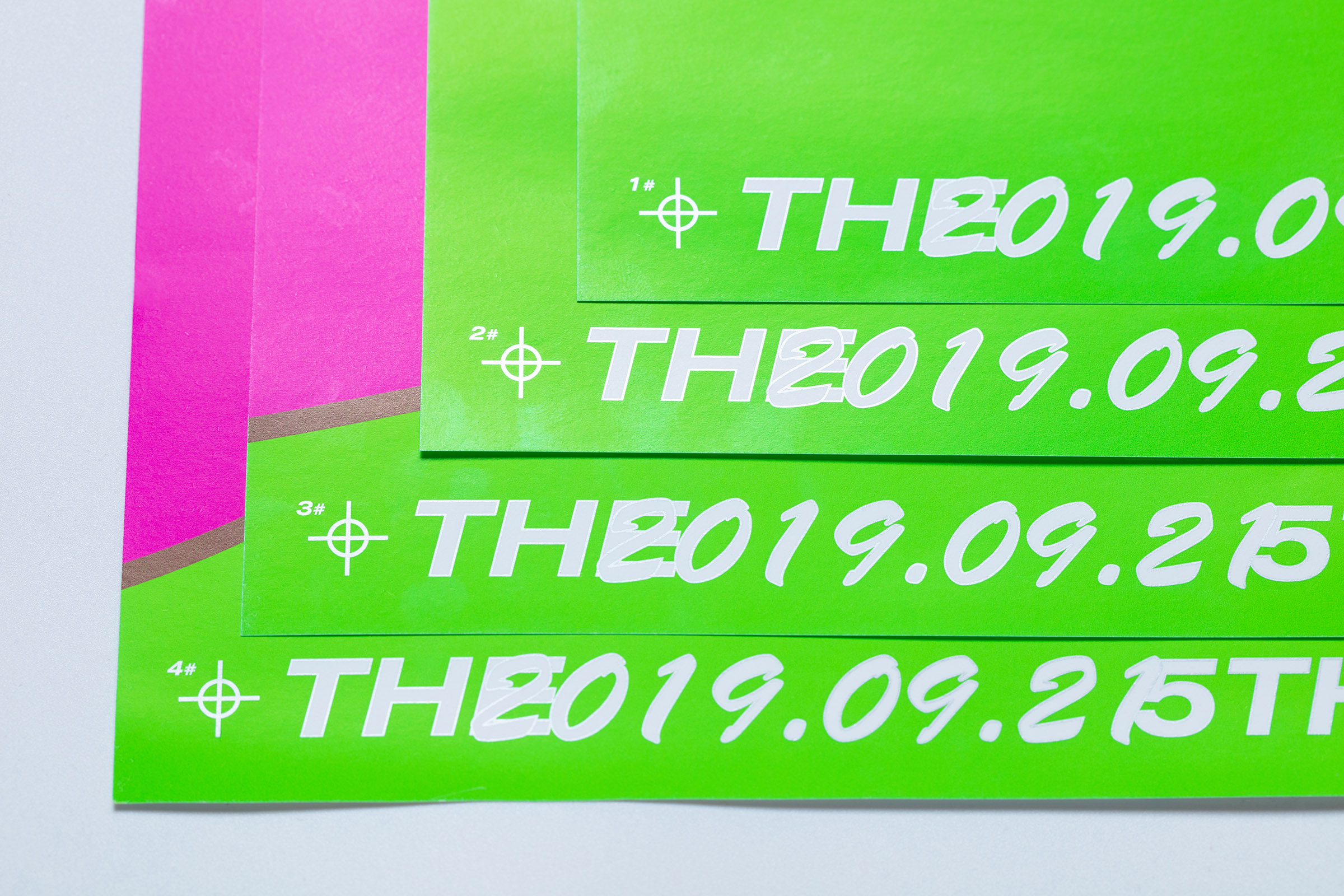
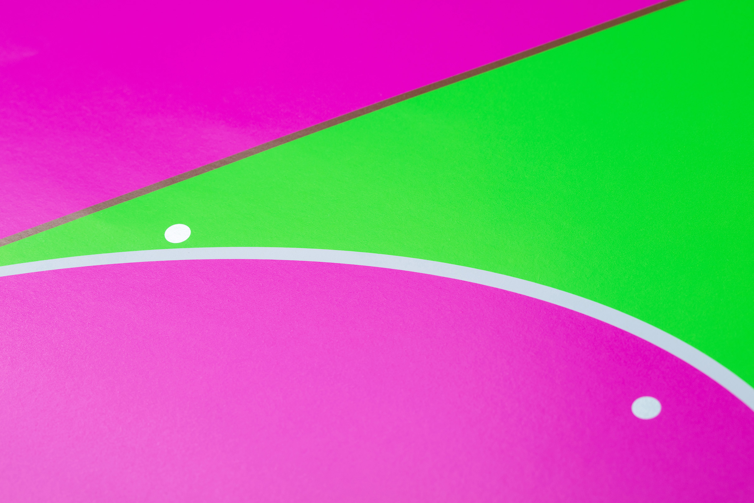
There are four posters in this series, each of which is a freeze-frame of the number 5 as it runs forward. We exaggerated these freeze-frame graphics to make the typography become confident and tense. These posters are arranged in order to show a running 5, which conveys the good vision of the studio on the fifth anniversary of its founding. The contrast between uniformly distributed silver dots and dislocated neon blocks as well as neat sans and cheap handwriting type make reading interesting.
這一系列海報一共四張,每一張都是數字5在向前奔跑過程中的一個定格,我們將這些定格的形態誇張處理,使得字形擁有自信具有張力的姿態,海報按順序組合起來便是奔跑的5的完整呈現,這傳遞出花生聯盟成立五週年之際的美好願景。畫面中,均勻分布的銀色圓點和錯位疊印的螢光色塊形成對比;信息中,規整舒展的無襯線字體與隨意廉價的書寫體形成對比,增加閱讀的層次和趣味。